Hardcover; 48 pages; 25 x 21cm; printed on Zerkall Book Wove in red, blue, orange, and black; weight: 0.5 kg / 1.1 lbs.
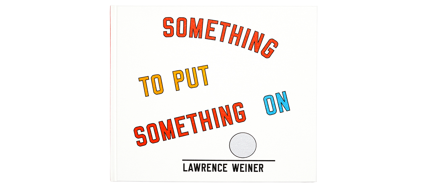
SOMETHING TO PUT SOMETHING ON
Lawrence Weiner
2017 (Zerkall edition)
Hardcover wrapped with printed buckram: stitched book block with integrated endpapers and a reinforced spine
25 x 21cm (8.5 x 10 in.); 48 pages, including integrated endpapers>
Printed in red, blue, orange, and black throughout
Materials: The book paper is Zerkall Book Wove (white, matte, 170 gsm), a cylinder-moldmade paper with cotton content. It is acid- and wood-free, neutrally sized, alkaline buffered, and contains no optical brighteners. The paper meets the highest standards of permanence in accordance with ANSI Z 39.48-1992, DIN ISO 9706 and DIN 6738. The bookbinder’s boards are Köhler Book, a pH neutral, cylinder-moldmade board from Albert Köhler Pappen in Gegenbach. The edition is bound in Arbelave Library Buckram.
Printing: book and cover were printed by Nina Holland on Little Steidl’s 1993 Roland offset-lithographic printing press using red, blue, orange, black, and silver inks.
Work and book design: Lawrence Weiner
Typeface: Margaret Seaworthy Gothic by Lawrence Weiner
Typesetting: Nina Holland<
Book production and printing: Nina Holland / Little Steidl
Binding: Lachenmaier, Reutlingen
About the book paper
At the heart of the 2017 rendition is one of the most exquisite papers of our time: Zerkall Book Wove, produced on an early-twentieth-century cylinder-mold paper machine at the historic family-owned Zerkall paper mill in Germany. The mill was founded in 1905 by Armin Renker, whose many writings on the history and manufacturing of fine paper should be well-known to anyone involved in the book arts. In its fourth generation under the direction of Felix Renker, the mill worked closely with Holland to plan and produce the paper for the 2017 edition of SOMETHING TO PUT SOMETHING ON. Each sheet was inspected by hand before it left the mill. One of then seven surviving producers of cylinder-moldmade paper in Europe, the idyllic Zerkall mill was tragically destroyed in the 2021 Eifel region floods, leaving only six mills to carry on this endangered papermaking tradition: Arches and Lana in France, Hahnemühle in Germany, St. Cuthberts in England, and Fabriano and Magnani in Italy.
About the typesetting: Lawrence Weiner’s MARGARET SEAWORTHY GOTHIC
While wet proofing, Holland and Weiner discovered that the fiber structure and quiet surface of the Zerkall paper gave unusual clarity to the edges, lines, and idiosyncratic rhythm of Weiner’s artist-designed letter forms (Margaret Seaworthy Gothic). The 2008 edition was set throughout using Weiner’s default letterspacing on the assumption that any awkwardness was an intentional element of the typeface’s design. When tested on the Zerkall paper, however, the marked gaps and inconsistent rhythms created by the default letterspacing appeared so pronounced as to be visually disturbing. The tone and rough surface of the paper used in the 2008 edition had distracted from this typographic problem, and it took an exceptional paper to bring it into plain view. Most importantly, Holland discovered that the erratic letterspacing was not intentional, and with Weiner’s agreement, reset the entire work, kerning every word as is typical of all-capital setting. The artist was thrilled to finally see his Margaret Seaworthy Gothic looking more dynamic than ever.
About the colors
Weiner worked with a limited number of colors across many artistic mediums and on diverse surfaces, including papers of all kinds, brick, concrete, plaster, and pavers. As a result, he was intimately aware that color is not just hue; it is material. This is particularly true with offset-lithographic inks. Each color has a markedly different material structure that interacts with a paper’s surface in a unique way. Some pigments are grainy and particulate while others are smoother and more powdery. Some mediums are more fluid; others more viscous. Some pigments function only with more transparency and rely heavily on the white of the paper beneath; others are more opaque. Some sit more consistently on the paper’s surface; others are visually integrated into the paper’s structure through absorption and give a mottled appearance.
Throughout his career, Red 032 and Blue 299 were Weiner’s standards, and he used them in SOMETHING TO PUT SOMETHING ON for the two voices in dialogue. As substances, these offset-lithographic inks are opposites, and if their material characteristics are rendered forcefully, a great tension can be activated. The goal of standardized offset-lithography, however, is to make every unique ink look and perform like every other ink, forcing visual consistency from diverse materials. Such an approach would not have been consistent with Weiner’s own understanding of his work as material sculpture. Rather, in SOMETHING TO PUT SOMETHING ON, Holland threw off the shackles of standardized offset-lithography to embrace the unique material characteristics of each ink. The Zerkall paper supported the expressive, almost rebellious inking method by magnifying the distinctive rheological qualities and personalities of the inks, animating an intense aesthetic tension between a fluid, speckled, highly transparent blue and a stiff, flat, viscous red.
About the cover
The cover of the 2017 edition resulted from a successful offset-lithographic experiment. The non-absorbent buckram cloth was previously considered unsuitable for offset-lithographic printing, and for this reason, the 2008 edition featured a silk-screened cover. Holland, however, felt it was critical to use the same inks and printing methods consistently throughout the work, and for the 2017 edition, developed a method for printing the cover cloth on the same vintage 1993 Roland 200 offset-lithographic press as the book. The technique required drying times of up to three weeks between colors, and the plates for each color had to be adjusted to accommodate the incremental horizontal expansion of the cloth that occurs with each run through the press. The offset-lithographic inks are jewel-like on the buckram in contrast to the dull, opaque serigraphy inks on the 2008 cover.
About the cylinder-mold paper machine
Many Little Steidl books are made with papers and bookbinder’s boards that are manufactured on cylinder-mold paper machines. As mentioned above, there are currently only six paper mills in Europe that operate these obsolete machines. The molds produce sheets with four deckle edges and a superior density and flexibility compared with papers made on a flat-bed Fourdrinier paper machine. The mechanical rotation of the cylinder mold produces a strong grain structure with excellent folding capability, in contrast to handmade papers. The composition of the pulp ranges from pure alpha cellulose to 100% cotton as well as combinations of the two. The papers are wood-free, neutrally sized, and alkaline buffered to meet the highest standards of permanence. Due to their high density (volume at or near 1.0), they are wonderfully flexible and graceful as a component of a properly bound book. Such papers are rarely found in trade editions, as they cost from 15 to 20 times more than even the best offset-lithographic papers and require special knowledge and care on press.
Bookbinder’s boards were also once produced on cylinder-mold paper machines. Today only one mill produces these traditional high-density cylinder-moldmade boards: Köhler Pappen in Gengenbach, Germany. The superior stability of a cylinder-moldmade board is felt immediately in the hands. You can also hear the difference by knocking on the board: it sounds like wood. For quality and historical continuity, Little Steidl uses these boards exclusively in its hardcover editions, including the 2017 edition of SOMETHING TO PUT SOMETHING ON. The boards have a volume of 1.0 and are specially produced for Little Steidl with an alkaline buffer, which counters the effects of environmental acids over the long life of the book.
About the bindery
The 2017 edition of SOMETHING TO PUT SOMETHING ON was one of the last books bound at the legendary Lachenmaier bookbindery in Reutlingen, Germany, before its closure the following year. The venerable historic institution combined the knowledge of master craftsmanship with machine production and served clients seeking virtuosic skill and detail-oriented collaboration (Steidl, Little Steidl, Chanel, Folio Society, Maximilian-Gesellschaft, among others). The independent bindery built on master craft training is today an endangered tradition. Shifts in the book market and plummeting quality standards in binding over the past forty years have played a role in the demise of these historic institutions. Equally disruptive is the trend among print houses to add binding operations to their line-up: a one-stop shop offering the convenience of an inferior product. Binding is a separate discipline for good reason and should never be handled as a mere mechanical add-on to the printing process. The result of this trend is broad implementation of binding “mistakes” and loss of diverse and versatile methods and know-how that evolved over centuries. Little Steidl continues to work exclusively with independent binderies and provides detailed information about its bindings and collaborating binders on the colophon of each book in the hope of leading others toward the best surviving craftspeople.
About the publication history
SOMETHING TO PUT SOMETHING ON was the very first Little Steidl book, published in 2008 as an imprint of Steidl and printed under the direction of Gerhard Steidl. Nearly a decade later, as Little Steidl became an independent publishing house with its own printing workshop, Nina Holland and Lawrence Weiner revisited the work, producing a second revised edition. True to its foundational position in the Little Steidl program, the 2017 edition of SOMETHING TO PUT SOMETHING ON was the first book printed by Holland on Little Steidl’s own Roland 200 offset-lithographic press – a new rendition of the work based on a decade of observation and rethinking.