Dinner at Little Steidl
Monte Packham and Nina Holland discuss The Blueberry Machine
The meaning of “Little Steidl” remains a mystery to many. The name conjures the idea of childhood, yet the books published by Little Steidl are not children’s books, that is, until The Blueberry Machine, our first picture book for young readers. It is, therefore, a good opportunity to clarify what Little Steidl is. Think of Little Steidl as the “child” of Steidl – a publishing house working in the same tradition but under the ownership and direction of the next generation, Nina Holland. Or think of a tree with two main branches, one Steidl and the other Little Steidl, connected by the roots. If you can’t separate them in your mind, it doesn’t really matter. The books are what is important. They speak for themselves. Each one is a world of its own and invites you to discover for yourself what Little Steidl really is.
The following is a dinner-table discussion in which Monte Packham (author) and Nina Holland (designer/printer/publisher) look back over the eight-year-long development of The Blueberry Machine and discuss when and why, at one specific point along the way, it became a Little Steidl book.
Helpful pre-discussion notes:
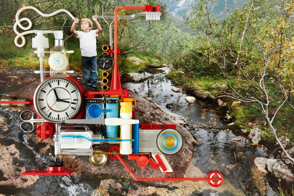
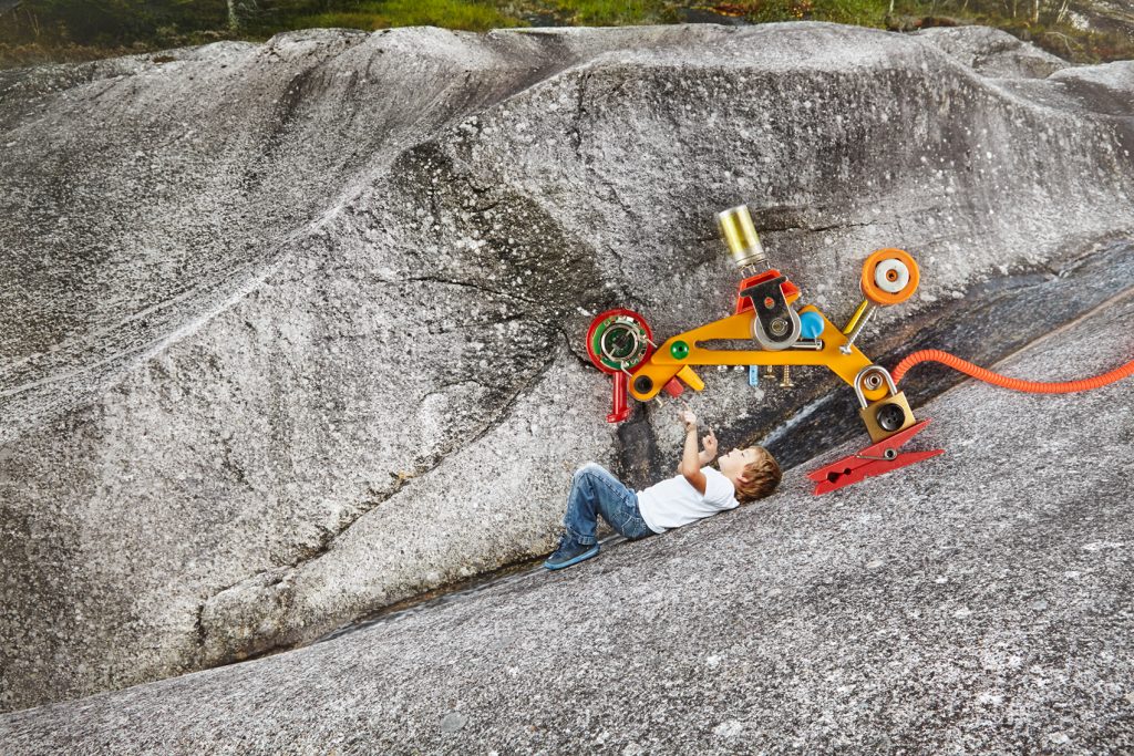
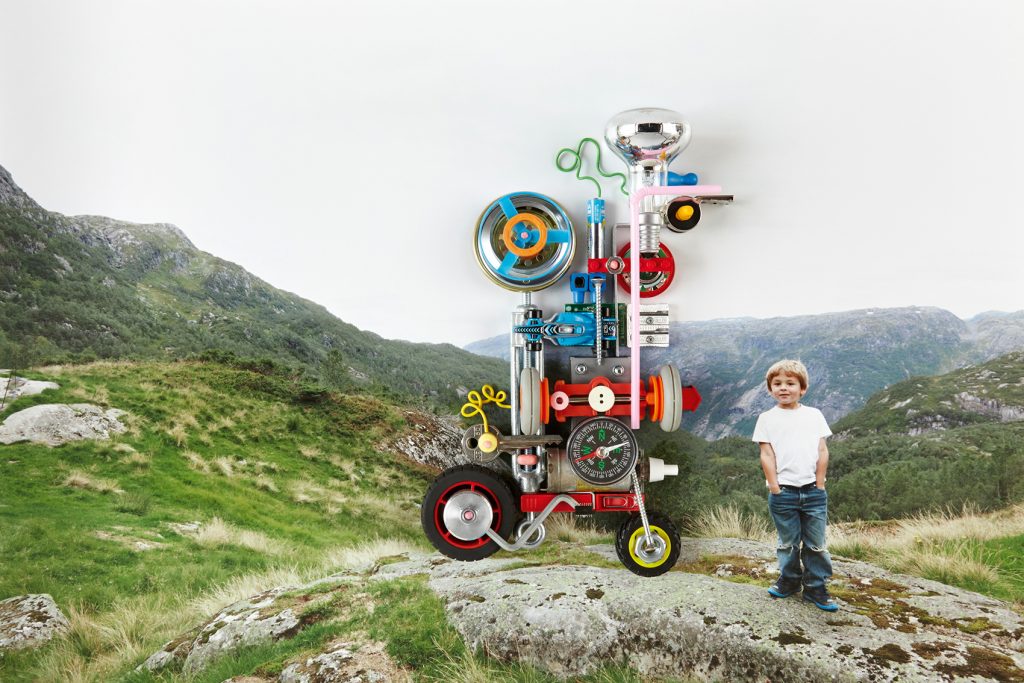
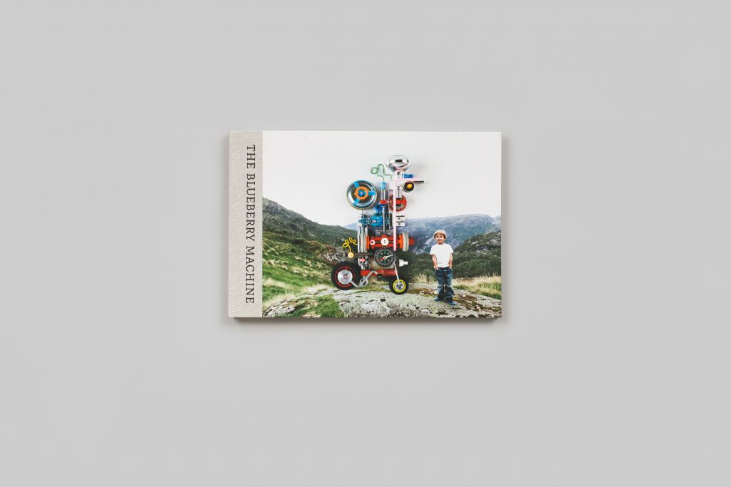
Olav, the protagonist of The Blueberry Machine, is played by Olav Must Nybø, who was 4 years old when the photographs were shot and 12 years old when the book was published. “Olav” in the discussion refers to both the person and the character, depending on the context. The book is set on the family farm where Olav grew up.
F&Gs, referred to throughout the discussion, are folded and gathered press sheets. These unbound first copies of the printed book are sent straight to the authors from the press, before the sheets are shipped off to the bindery.
Digital images viewed on screen provide only a basic content reference and cannot show the printing techniques described in this discussion. We also regret that we cannot show the typography in any meaningful way on screen. These aspects of the discussion can only be understood with the book in hand.
The discussion begins:
NH: It was so touching to me to think recently about the eight years that had elapsed in the development of The Blueberry Machine and then to see Olav with not yet the finished book but with the F&Gs in Norway. He was four in the book and now he’s twelve, really a young man, and the human development factor was suddenly visible for me. But not just in Olav. I have also noticed that most Little Steidl books take eight years to fully develop, and I see now that the same issue of human development is behind this. There’s a Werdegang or becoming involved with making a book, and seeing the book next to Olav was a tangible reminder to me of why it often takes eight years. It is a human development process, not just an artistic process. There’s a course of becoming a new human being or entering a new phase of one’s life that a book entails.
MP: Yes, and it surprised me when Jan said that Olav can’t remember taking the photos. At first I thought, what a pity because it must have been such fun. But then I thought, how wonderful it is that the book is the way for him to actually revisit that history and that moment of creation. It’s as though, through the book, he’s gone back into his own memory. And he read it so earnestly. It wasn’t like, flip-flip…no, no, no. Rather he would read the text, look at the photo, enjoy the rhythm. He was really absorbing it page by page.
NH: When the photographs were taken, he spoke no English at all. The process was really gestural…
MP: …so was it just the two of them, Jan and Olav? I didn’t realize that.
NH: Yes, and their communication didn’t involve any language that either one of them, Jan or Olav, could understand. But after the eight years that have passed, Olav is now fluent in English and can read the book himself.
It’s also touching to look back on the whole process and to see how two of my greatest friends developed. When I hooked the two of you up for this project, Jan had never collaborated with someone who was working full-on from a creative literary standpoint. There had been a didactic element to most of the children’s books that he had developed with different publishers.
MP: Yes, not really fiction.
NH: So that was a real shift of gears for Jan, something I had always wanted to see. But you also had not yet conceived of yourself as a children’s book writer.
MP: Well, when we started I wasn’t really even writing verse.
NH: Mmm…no, you were, definitely. You had written at that point poems for the births of your nieces and nephews.
MP: This is true, but that was private, I hadn’t published anything.
NH: True, so what I was going on in making this connection with Jan were the Milly Molly Mandy story – your “amendment” to the series [laughter] – and the poems. But also many hundreds, if not thousands, of humorous exchanges in which there was a certain language play involved. And then I had a nagging sense that, up to that point, you perhaps hadn’t yet found the right creative endeavor to develop your talents to their fullest. I felt there was something still latent in the background that was waiting to come out.
MP: When I look back to my first draft – it wasn’t even called The Blueberry Machine at that point, it was just “the book” – it was prose. Maybe for the first five or six drafts, it wasn’t verse, it was prose.
NH: I remember that the book was not at first conceived as a fully creative work. Well, that’s not quite right, but it was being pitched to publishers and discussed with publishers that weren’t necessarily children’s literature publishers.
MP: We shouldn’t forget to mention that at the beginning, when you connected us, it was not a Little Steidl book.
NH: It was not planned to be. It wasn’t even…
MP: It wasn’t even something in the back of your mind.
NH: No, because it just didn’t fit the program. So the interesting thing to me is when it did become a Little Steidl book, and I grabbed it.
Initially Jan showed me the images and the text that he had written for them, which was very comparable to the kinds of texts that he was writing for his newsletter – just very light-hearted, reiterating what we see in the images. And I just felt … well…how can I say this? I think that my advocacy, even beyond advocating for the artist, is that I’m advocating for the work. So when I see that an artist is doing something that does not optimally serve the work, I feel obligated to step in and stand up for the work. I can’t help myself. When Jan first showed me the images and his text, I felt, these images are amazing! But the text is not doing them any service. And there has to be something better for these pictures. I didn’t quite conceive of what that was, but what I suggested to Jan was that in the great tradition of children’s picture books, that should be a very creative and dynamic relationship between text and image. It shouldn’t be explanatory. It’s not a caption.
MP: It’s not one illustrating the other.
NH: Yes, it’s not explaining. It’s not didactic. It’s a really active, creative interplay between the images and the story. So that’s what I had hoped to see: a text that would be enriched by the images and a text that would in turn enrich the images.
Looking back, I think that what Jan had in mind, especially given the publishers that he was talking to at the time, was a book that was focused on the idea of Olav saving the world. Is that right?
MP: Yes, that was from the beginning the idea. That actually could have been the first draft title that we had.
NH: I think it was. And Jan was really preoccupied with the idea of a parent’s role in reading the book to a child. He thought that the text had to deliver to parents enough information to be able to explain to their children what was happening in the images. I remember a dinner that we had together at an early point. You had been working together. Jan was talking to publishers actively about the book and how to develop it. And I was just a bystander at that point. But I know that I really made a pest of myself at that dinner [laughter] because I just so disagreed with everything that the publishers were urging Jan to do. And I disagreed with Jan’s instinct that there had to be enough information for the parent to then mediate and explain to the child. What do you remember from that early phase?
MP: It was a completely different book back then. But before I explain that, I want to go back to what you said about the relationship between image and text, that you don’t want one illustrating the other, you don’t want one describing the other. Whenever I write a story based on images, when I’m done and kind of halfway happy, my test is to remove the images and to just read the text and see if it functions by itself. And to see as well if I could give that text back to Jan or maybe to a completely different artist to use as a basis for images. And if I think, yes, then I’m happy, then I think it’s working.
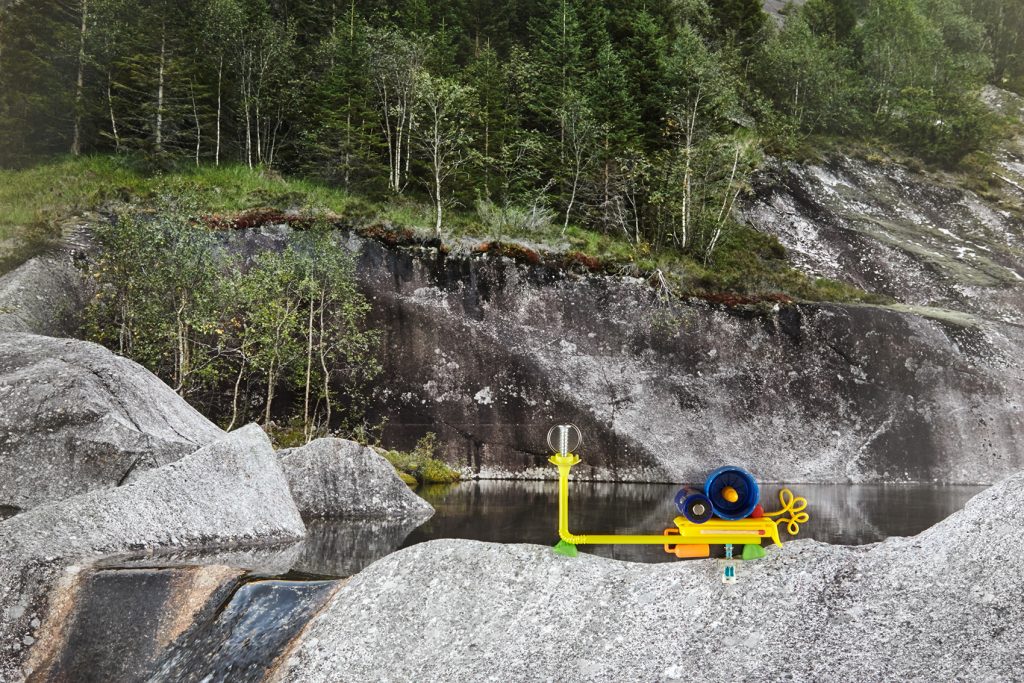
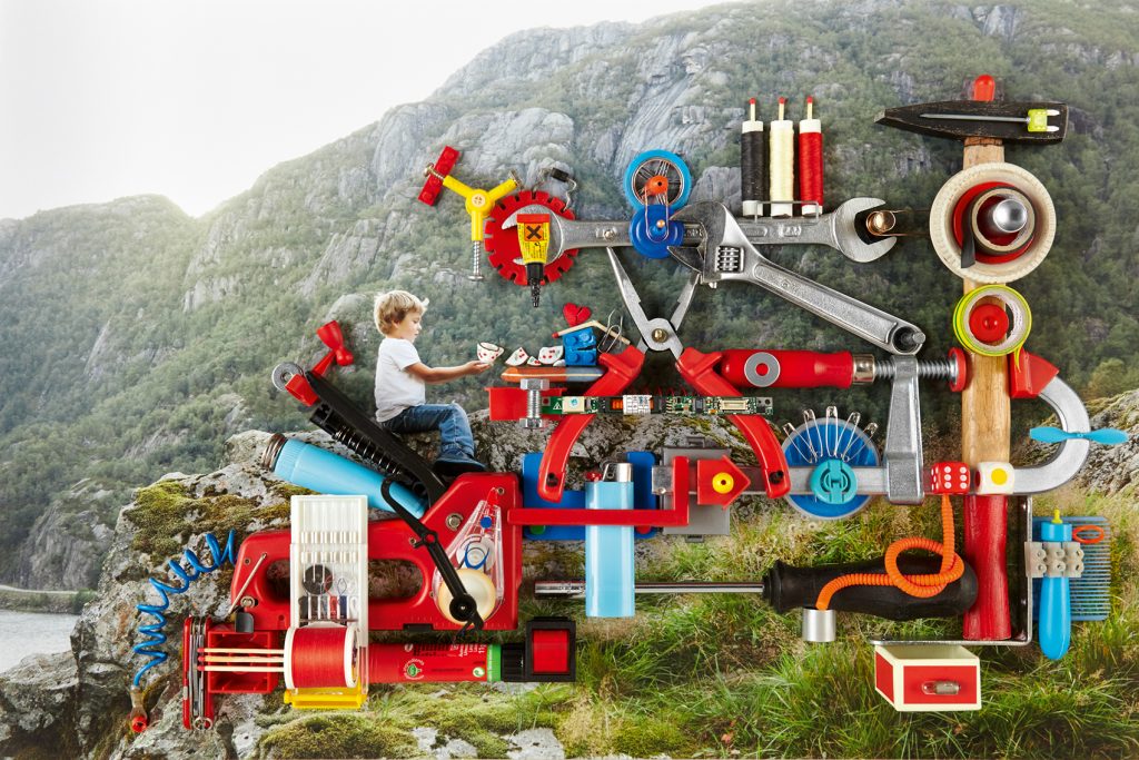
And so I remember, it must have been after this dinner, the first time that Jan showed me proper prints of the Olav pictures. It was an afternoon and we were at the Ocelot bookshop in Berlin, and I think the sequence was pretty much as it is in the book now. You start off with Olav collecting various objects, the electricity machine is the first one, and the last picture is the snow. And when Jan was showing me through, he obviously had concepts for these machines. He would say, this is the electricity machine, this is the one which uses wind and stores the power, and then this is the great ideas machine, and this is the recycling machine. So the idea of saving the world is in the machines. It’s within Olav’s head. And the mistake, well not the mistake, but what I first tried to do was too didactic in saying, this is the machine to do this, and this is what this is about, and Olav’s mission is to save the world. A child doesn’t need to be told this. A child will see what the machine is about, they’ll know what it’s about…
NH: or invent their own explanation.
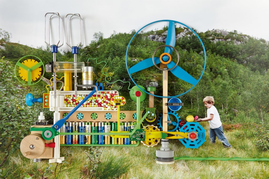
MP: Yes. And I think the one thing that was set in my mind at that stage, even before I started writing, was that the character of Olav is seen through the machines. Through his creations, you see what kind of person he is. He’s not the child who just makes a whole bunch of fun machines or machines to make lollies or whatever. He says, no, no, no, it’s a recycling machine. So for me, his personality was very clear through his creations.
NH: It’s really interesting to hear you say that because of the story of Olav’s father connecting with this book through his own machines.
MP: yes!
NH: It was such a day when this story came in first thing in the morning through Jan. I just set aside the whole day to digest it. So Olav’s father first connected with this book when it was delivered as a book. And it does make a substantial difference to see this as a book, a real object versus seeing the images on screen or even as F&Gs of the book. Olav’s father was the first to encounter the book in the morning because he was the first up in the house when it was delivered. And it was the first time over the eight years of seeing various forms of these images and hearing explanations of how the book was developing that he really actively engaged with it and saw himself in it. And the point of connection was, of course, the wonder machine that stands in the background and doesn’t make it visibly into the book: the printing press that makes the book. He was acutely aware of the quality of the printing, the paper, just the beauty of what he was encountering, and how different that was from other books that he had encountered. And it led to a very in-depth discussion with Jan about my machines in my printing workshop and how this book was made – that it’s an old machine, a vintage machine. It doesn’t have any…it’s fully mechanical and operated by a human being, not by a computer.
MP: It could have been operated by Olav.
NH: Yes! And the way I work with my machines matched exactly their aesthetic on the farm with the tractors and the farming machines that they use, which are very old-school and produce a certain quality. He was recognizing all of these parallels in the book. So I love the idea that the Olav character is understood through the machines, and that in fact the way his father connected with this book was through the machines. And that this creative collaboration – and it really is a creative relationship – between the human being and a machine is something that can express so much of a human character and point of view. I think that his father saw so much of his own life and experience reflected…
MP: …which I think a lot of people will do because whether you’re still a child or whether you’re no longer a child, you made stuff. You took everyday objects and you used your imagination but also your physical building skills to create something…
NH: OK, we need Lawrence!
[laughter as Nina runs to the bookshelf]
NH: We need Lawrence Weiner at this point to interject his line: I was a child and as most children I did make things.
MP: Thank you, Lawrence! Children can build something collectively, yes? But I think we can all remember moments when we were building something by ourselves, just the child and the material and the child’s idea. And it’s always an experience that adults recognize, and quite often they’ll leave the child in peace because they can see, no, no, the child is in his or her little universe. Let them continue their creations. I think that’s something everyone will relate to.
NH: When Jan first presented the images and the concept behind them to Olav’s family, it was in the cultural sphere, in the sphere of artistic endeavor. And this wasn’t really the father’s priority or really what he had been concerned with throughout his life. But what I love is that in the end, art and the father’s activities in farming, what he goes through every day… these worlds are linked. His own experiences as a farmer working with these machines, all of the hardships related to the Norwegian climate, these become a point of connection and understanding to an artistic work. There’s this commonality, and they begin to speak to each other. And he can see the liveliness and the creativity in his own work, and he can see the practical value and beauty in the artistic work through his own experience. I just loved that the relationship between human being and machine was so active.
MP: And it’s also such a personal one. Because it’s Olav’s imagination that creates these very specific machines from materials which could make any number of machines potentially. And I’ve got to think back, it’s machine number three in the book. After we had coffee and Jan had walked through all the machines and I was planning the text, I couldn’t remember what he had told me number three was. And I thought, it’s a lolly machine or a machine to make candy. But Jan said, no, no, it’s the protection ball machine to protect against an enemy. And I just thought, well, for me it didn’t register like that. My solution was to say, well, let’s not say what it is. Let’s have the narrator say, this is number three, I don’t know what it does, but do you know what it does? So getting the reader, the child, to speak to Olav directly and to the machine directly and make up his or her own mind. This machine number three is whatever you want it to be. And that was for me a turning point. The image was a basis for my words, but you don’t want to over-describe, you don’t want to point out always what the machine is. It was a mixture of sometimes picking up particular details in a machine – a teacup, a match, a broken heart – little ways maybe to guide the reader into the image but not point out what’s there because it’s all there to be discovered. That was one of the faults with the early text. I was too hooked on saying, this is the electricity machine, this is the recycling machine.
NH: One of things that was the most objectionable to me in the earlier phase of the project, when it was being pitched to other publishers, was that the parent would play such an active role in mediating this experience for a child. Maybe that’s a particularly German perspective, I don’t know. But that didn’t strike me as being where the best children’s literature has come from. The anxious parent wanting to be able to be the authority in their children’s eyes and explain everything to a T and deliver an experience for the child.
MP: Exactly, it’s not an educational tool. It’s something you learn from, yes, but it’s not an educational tool.
NH: Then later you really came in with the surprise that turned everything around. You had produced the little mockups with the full text and images together, and in the text, suddenly there were… well, it’s a multi-layered, multi-spatial text in that we have a sense of certain characters, the family, that we never see, we never actually encounter them. They’re in one place while the story is taking place, and we leap off from their initial reality and instructions to Olav, and then we become more and more and more immersed in Olav’s activities. It’s really a performative text at that point. We are following down the path of Olav’s fascination with what he’s doing. And we’ve lost track, at that point, of these characters who have been left behind. And how these non-visible characters enter and exert their presence and come back at a point in the narrative is wonderful structurally. It’s dependent not only on the language but also on the relationship between the language and specific images. That we can navigate back and forth between Olav’s mind and what’s happening back at the house with the other family members, yes, it takes place in the verse, but you’re also negotiating it very actively in the way you’re sequencing the images and using broader landscape shots as a way of pulling out from the micro-focus of Olav. So I began to see a dance between the images and the verse. And then, the fact that it was verse! I mean, I think this was maybe…
MP: That was the turning point!
NH: …my first encounter of the story in verse. And I thought, wow, of course this needs to be verse. I mean, what else would it be?
MP: Because I think, if I remember properly, the prose text went through a number of drafts, and Jan and I at some point decided to leave it for a while because we’d kind of… He’d shown it to the publishers. I’d made changes. I’d brought in new ideas. I think we had maybe four or five times, and we both thought, look, at the moment, we think we’ve given it what we can. Let’s just give it a break.
NH: What was your feeling at that point about what wasn’t quite right or what wasn’t working?
MP: For me, it wasn’t a story. Basically, the idea back then was that Olav had been at home in winter, a very cold winter, and he was stuck in the house with his family. Helicopters had to bring up food and supplies into the valley. But Olav hadn’t minded because he’d been reading the whole time and planning his machines. Then spring arrives and all these machines blossom. But that was it. There was no story. It was basically just descriptive. And then when we said, OK let’s just leave it and I’ll have a shot at it later, I was in the middle of writing the rainbow rhymes, and I said, maybe I’ll give it a shot in verse. At the time, though, I didn’t know if I could, or if it was even possible, because the story I wanted to tell was complex. As you said, it’s not just saying what Olav did. It’s firstly introducing the real world, it’s making the shift into Olav’s imaginary world, and it’s coming out of it again. For a young child, that’s a lot of shifts. Can you make that clear enough in verse so that you don’t lose the child? Because if you lose the child after one line then you’ve lost the child, you’ve lost the reader. But I think it was before Christmas when I was done with the verse, and I sent it to both of you. It wasn’t just the story, I think the actual metrical bounce of the rhyme and the musicality of the verse mirrored so well all of the sounds the machines make, which you need to imagine. It’s the connection of the machines and building and all of the sounds that they involve with the actual sounds that come out of your mouth when you read the book.
NH: That’s right! I felt when I read the verse that you had just jettisoned everything that had come before it and alighted on the story that needed to be with Jan’s images and exactly the right way of expressing it. And at that point, I said, OK, this is a Little Steidl book. I also recognized, given the kinds of discussions that had been going on with other publishers, that the book needed Little Steidl. I didn’t think that anyone else would give it the respect that it needed to have. I just felt very protective of it at that point, and I didn’t want to see another publisher destroy it. So I said, OK, this can be…
MP: this is it…
NH: this can be at Little Steidl now. Now it makes sense. Now it’s speaking the language of a Little Steidl book, which is a pretty high bar. It’s a standard that runs across the publishing program – all of the artists’ books in each of the artistic disciplines – yet the standard is derived from children’s literature and from my experiences in my own childhood with the picture book. I mean, the best children’s literature functions as a really essential relationship between text and image, a non-substitutable connection in which each extends the range of the other. This idea really formed in my mind during my childhood in encountering so much children’s literature through my grandmother, who reviewed children’s picture books. She reviewed the illustrations but her partner reviewed the literary component…
MP: Oh, it was a collaboration? I didn’t know that.
NH: Yes, they were a team. And they had their standards for their respective disciplines, but it also was about the craftsmanship of bringing these two worlds together, the visual and the literary. And every single element has to perform. It has to serve a function. It is not enough for it to simply sit there and tell you what it is. It has to push the story forward, it has to have a functional basis. This sense of purposefulness carries forward for me even when a book is fully visual, with no literary element.
MP: This reminds me of my niece. If she doesn’t like a story that is read to her from a picture book, she’ll make up her own text. So it’s reading, she’s turning the pages, but she’s making up her own story, a different one each time.
NH: Ha! And we even share a name! My standard for the artists’ books on the visual arts side of the publishing program is that every element of the book has to move it forward, has to perform. There’s a kind of mechanical energy behind every one of the books. And that’s coming out of my conception of children’s literature, which I think is one of the most effective genres that’s ever been developed in the book form. I see it as the model for the modern/contemporary artist’s book. They function on very similar terms. And so when you presented the verse with the images, it was like a well-working machine. Everything functioned as it should.
MP and NH in unison: [laughter] …as it rightly should!
NH: And at that point, I knew it was a Little Steidl book, but I also knew that it needed Little Steidl, that I could bring a certain understanding to it and develop it as an object in exactly the way that was needed to support the kind of work that you had done and the kind of work that Jan had done. I mean, it’s a lot of work to make a book, so I want to know that what I personally bring to a book will make a substantial difference. I’m not the right person for every project, for sure.
When I develop a project with an artist, I deliver back a work that allows the artist to see his or her work in… not a new way, not from a different angle… It allows the artist to see him or herself. It’s almost like a more concentrated version. If you imagine what it must be like for a filmmaker to watch his or her own film – you can’t possibly enjoy that as a film. You can’t experience it ever as an audience member would. But my objective when I make a book is that when I give it back to the artist, the artist is able to experience his or her work as if seeing it for the first time. And I don’t mean that it’s such a radical intervention that the work is no longer recognizable. The intervention should be invisible, and it should elevate or concentrate the methods of the artist in a way that the artist could not do by him or herself in the book form.
MP: I think that in terms of the text, the way you were able to do that for me was through typeface and typography. I remember at the beginning when I made the preliminary maquette that I sent to you, it was in Garamond. And I remember discussing way back that it should be a serif face. It’s a story being told, and I want to reference the verse that has come before it. But I don’t want someone to see that reference straight away. The typeface has to tap into that history, but it also has to be fresh and match obviously the machines as well. Apart from saying that, the only thing that I thought was necessary was that the italics had to be…
NH: real italics.
MP: So that when you read it, you literally change the rhythm of your speech.
NH: There had to be a visual rhythm that matched with the auditory rhythm.
MP: Yes, and you couldn’t miss the italics.
NH: Particularly because we’re talking about one or two words per page that will be set in italics, and they have to be immediately seen so that the reader can adjust the rhythm without stumbling or missing a beat in the verse. It triggers a rallentando or a shift in emphasis, but the meter of the verse remains intact. This is visually also like walking a tightrope. There are usually four lines per page. It’s a minimal setup, so if a shift to the italic takes the block of lines out of balance, it’s problematic. The italics of some faces would be too disruptive in this context, really visually unappealing and out of balance. The italic should not introduce a thud in the composition. It has to maintain the visual continuity and balance while distinguishing itself, all in line. Not an easy task.
It was an interesting process to find the right typeface. Once we decided it had to be a serif face, then the question is what kind of Antiqua is it? Is it a Renaissance, Baroque, or transitional face, or a more modern serif face? And it has a lot to do with slant. In the older style you see a backwards slant, for example in the O, it’s easy to see. When you look at the thick/thin variations of the stroke, the thin is roughly at the top and bottom, the thick at the sides. And if you look at the axis from thin to thin, the older style slants backward, the transitional style is nearly vertical. There is also an evolution – and this is only a very general explanation – toward greater stroke weight differences, the thickness and thinness of the lines, and from angled to horizontal terminals and serifs. So we started with some older faces as well as newer faces derived from these. Sabon, for example. Also some very new faces derived from Renaissance and Baroque Antiqua faces from the same foundry that publishes Andersen, the face we eventually selected. But it was so interesting to see how formally these didn’t fit. Given the mechanical nature of the images, they felt too classic.
MP: The playful mechanical nature, that was the tricky bit.
NH: Yes. And then this typeface Andersen was so revelatory. It’s an old face but it’s also very modern in its approach. It has a particular rhythm and a peculiarity to certain letterforms – the p, b, and d, for example…
MP: But a peculiarity that you need to look to see, and for me that was like so many details in the machines…
NH: That’s right. Not gimmicky or flashy. Just elegant and right. I showed you the Andersen typeface, and we decided, yes, that’s it. And then I went on to research it and discovered that the typeface was actually developed for children learning to read. I just thought, oh my god, really? I love it when you make a purely visual decision and then you find out afterward that the facts and the history back it up. So this was a sign from the gods of typography.
MP: Also it was designed for dyslexic children.
NH: Yes. It has to do with those different attachments to the stem, the bowl and stem attachments of the b, p, and d. You’ll notice that there’s an open attachment of the bowl to the stem on the b, that’s closed in the d. The b and the d are formed quite differently. It’s not a parallel construction, the way that the bowl meets the stem is different.
MP: There’s something with the lowercase g as well, right?
NH: It’s the italic g that is gorgeous. It has that little wing or ear that’s just beautiful. Yes, it had all the dynamic qualities that we needed to match the machines, yet it has this classic feeling. A seriousness. And there was nothing kitschy about it, nothing gimmicky about it. It just was a great fit.
MP: I think seriousness is right because for me that was also from the beginning an important part of Olav. What he does is not just play. It’s not just fun. He’s on a mission, you know, these machines have purposes, and…
NH: You see, I think that was the connection that Olav’s father came to understand. This isn’t just play, it’s not just fluff. This is real. And I think that the typeface reflects that.
MP: I think something unique about the verse in this book is that they’re obviously my words, but the voice of the storyteller is another character. The child is being spoken to directly and being told, I’m going to tell you a story about Olav’s grand machines of glory. And the story happens, but there are moments as well where the storyteller directly speaks to the child, getting back to machine number three, I don’t know what it does, maybe you do, have a guess. For me, the type and the typography had to capture the voice of that storyteller, that it was someone speaking directly to the child. And that’s something that we spoke about the whole time as well, that I want this to be a book which is read aloud, by children, by parents, by whomever, and not only the words and the punctuation but the type needs to give them guides about how I’d like – not how they should read it because everyone has a different voice – but I wanted to give them as much information as I could about the musicality of the verse.
NH: This is what a composer does in the musical notation, of course. So you’re right on target with your thinking. There are the standard marks, similar to punctuation marks, but there are more subtle influences as well. The masters who engraved musical scores by hand were also musicians. They considered how the musical work was reflected visually in the composition, flow, and organization of the notation on the pages of a score. In the setting of verse, these subtleties influence how the text will be perceived and performed by the reader.
There are also clues that will help an emerging reader enter into a page with only text. And there are a few such pages in The Blueberry Machine, particularly at the beginning, that are only text. In the Andersen typeface we have a wonderful sympathy between the forms of the letters and the machines, the kinds of details that someone can be drawn into. I think we overlook the fact that reading is a visual activity, and learning to read involves tremendous visual acuity.
MP: It’s shapes.
NH: Yet we tend to focus on the auditory and ignore the visual language that is being deciphered. I became aware of this with my daughter, who learned to read before she began to speak. She was very visually perceptive and would sit fully engaged in chapter books with very few images. But she was looking closely at the text in a way that we associate more with images. She was following along as I read, and making connections between what she heard and what she saw. We were just having fun. She would point out the obvious words in picture books that corresponded to images, so I thought one day to ask if she could show me the word “the,” something almost meaningless. And her little finger tracked over a whole page of text and found all the the’s. That was how I began to appreciate the visual aspect of learning to read. And I’m aware that it’s an internal and personal process in the child that an adult can’t teach directly, but one of the ways we can help move this process along is by putting an absolutely dynamic and beautiful typeface in front of the child. And I think this typeface, Andersen, really delivers the kind of detail and peculiarity, even on the pages where no picture exists. It holds enough interest for the child. If we had chosen even a humanist sans serif like Gill, it just would not have had the liveliness of line and form.
MP: Liveliness, but also simplicity and clarity. It can’t distract. Particularly at the beginning of the book where, you point out, the text without images is so important in setting up the structure of the book, setting up which world you’re in, and then the shift into Olav’s imaginative journey. Although it’s bouncy, the shift is actually complex and the child needs to stay with it the whole time.
NH: Yes, I think that’s true. In some ways, a sans serif, particularly a geometric sans serif would have been too streamlined, too simplified, and too uniform for a child to enter into. For a young person who is still learning to read, the streamlining and elimination of visually meaningful detail can be, strange as it may sound, a kind of distraction. Like trying to tease out individual elements from a thicket of sameness. I mean, I don’t know a lot about the possibilities of aiding a dyslexic child. It would be interesting to talk to the type designer, Thierry Fétiveau, about it. My understanding is that a pronounced visual rhythm and diversity – as opposed to a uniformity of line and streamlining of form – is a key issue. But even for a non-dyslexic child, there are so many entry points of interest into the Andersen typeface. And I wouldn’t call them in any way ornate or decorative. These are really structural. It’s a kind of reinterpretation of the old-style letterforms from a consciously structural point of view, almost a machine-like standpoint in the sense that the parts of a machine have discrete and necessary functions. There’s a beautiful aesthetic behind it, and there’s a meaningful diversity in the letterforms that allows a child to enter in, have an interest, figure out. There are questions. Why does this form close, why does this form stay open? Those must be different. There are all kinds of clues in the letterforms that a child can latch onto.
MP: I think also there’s an interesting link between the typeface and how we all write, in that if I write a line of capital B’s, there will be some where I don’t close up the gap. So it’s showing the child also how he or she makes marks, but within the typeface itself.
NH: In a sense, it reminds our modern selves of the principles of the old face and its origin in handwritten forms.
I probably don’t need to point out that this attention to typographic detail is not typical in most books, but especially not in children’s books. The attention we’ve given to the type is on a different level, and I’ve put so much into it because I know, through my experiences, that good typography will make a difference for the children who encounter this book. Beauty and visual interest can be a bridge into reading. So on those pages at the beginning of the book, and then a couple later on, my hope is that, in the absence of images, little fingers will instead begin to trace those interesting lines and rhythms of this wonderful typeface. The size of the type, the line spacing, the italics, the kerning, everything is designed to be within the grasp of tiny fingers and hands. I think this is my parallel to your narrator who addresses the child directly. I’m speaking directly to the child through the typography and opening a door that perhaps many parents and teachers won’t know how to open. I want to communicate my profound respect for the child’s ability to be curious and to figure something out.
MP: You also have an unusual way of developing your micro-typography directly on the printing press. I had never seen this before, but it’s fascinating to have the chance to work out the tiniest details by seeing the real type in ink on the real book paper. There’s no comparison to what you see in a digital printout.
NH: Exactly. Every single line in the book was tested twice on press. It can be done quickly and efficiently. The tone and optical qualities of the paper have a direct impact on how type appears and functions, so it is always worth the extra effort. Also the weight of the typographic line is absolutely accurate in offset lithography, whereas what you see in a digital print has an exaggerated weight. So it’s impossible to judge the relationship of figure to ground in a digital print. Impossible, period. I actually added half a point of leading, which is the spacing between lines, after the first round of tests. It helped the visual stability. It reduced the tension between figure and ground for this typeface on this particular paper. That’s very important for young readers – that the eyes can go to the right place without visual strain or distraction.
MP: And I don’t think the typeface will date. For me it’s the combination as evoking past typefaces, as in a book of verse from Hilaire Belloc from 1930 or whatever, but its also modern, and not in a way that is sleek or designy. It’s not trying to show off. I guess for me, it’s Olav. It’s the combination of seriousness and playfulness. That’s the machines, the basis of the book.
NH: I also came back, as I heard the story of Olav’s father and how he related to this book, to the concept of Joseph Beuys that every person is an artist. The book enabled Olav’s father to see himself as an artist and to see all of his ingenuity and craft in the artist. And, yes, that’s who Olav is. Serious and creative at once.
MP: It’s funny when I think back about…not to give anything away about the book…there’s a key image, not quite the last, in which the title of the book gets fully revealed. It’s a very different image compared to others in the book, and for me there was always the question of how this would fit in with the story. I’m a big fan of books which have a twist at the end, one that you’re not expecting. You probably think that the book is over, that it’s enough. You’re not waiting for a huge revelation. But there’s a question that is hinted at through the title of the book, which is always at the back of your mind.
NH: This is another very complex layer of the story that appealed to me, the question of the title and the idea of the blueberry machine, and what the blueberry machine is. How did that develop for you? How did you get to that idea? Because it’s really not obvious.
MP: The same twist was actually already in the very first prose version – what the blueberry machine is. So I think that revealed itself quite early on, but the challenge was how to work back from that image and to make the whole book in a sense a journey toward an explanation of its title. You might forget along the way and you should forget along the way. But then you’re brought back to reality. You’re brought back to the issue of blueberries, which at the beginning of the book is made very clear. But then the question toward the end of the book is, why is this book called The Blueberry Machine? What is the blueberry machine? Have I seen the blueberry machine already, or not? Actually, no I haven’t because that was the electricity machine or whatever.
NH: We did have one reader spot the blueberries in the food machine, but the comment was, oh, so he did collect some blueberries, but he just didn’t really think about them in the context of collecting blueberries.
MP: For me it’s another sign of Olav’s wonderful kind of slightly distracted genius. He’s got so many important things to do that a detail like that…he either doesn’t see it or he’s moved on the next thing.
NH: It had a higher purpose than a blueberry pie.
MP: Yes. Page to page you get the impression that he’s always got another important thing to make. It’s like, done, next.
NH: I think that the message is ultimately very empowering to a child, isn’t it? To say, it’s not the fancy contraption. Look, that was made. I know that you don’t want to give away the ending, but really the people who will read this discussion are not the little people we’re concerned about shielding.
MP: True. So let’s say, the revelation that Olav is the blueberry machine is like a final flourish. But for us, it’s been this joke for years now that the blueberry machine is on the cover.
NH: Yes, and the machine is pointing at the blueberry machine.
MP: That was why the title worked for me. I mean, it’s a very simple title. It’s not trying to be clever, but of course when you hold the book in your hands and you read the title and look at the image, your first thought is: that is the blueberry machine. And you ask yourself, where are the blueberries? Does it make blueberries? Do you need blueberries to make it work? How is it the blueberry machine? It’s hard to put myself in the position of someone who’s not read the book before, but I would think that you are waiting for this particular machine from the cover to reappear in the book.
NH: That’s my experience hearing different readers’ reactions.
MP: Yes? That you think, this is the blueberry machine. It’s coming back…
NH: Yes. They’re looking for it and asking, is this it? Is that it? This must be it! And looking back to the cover to compare.
MP: But you don’t get to it. And then that arrow was the most amazing thing, which for eight years, I didn’t…[laughter]
NH: You didn’t notice it, ha! Jan didn’t notice it either, and he made it. It’s the kind of thing that maybe I would notice as the printer because of the specific way that I have to look, and it was actually very late in our work process, during the print run, that I saw it. So we are all discovering as well, even the makers. The work always teaches us something in return for all of our efforts.
MP: I think a book that poses a question even before you open it is off to a good start.
NH: Definitely. When I saw the first version in verse, it had not been called The Blueberry Machine previously, so that was a totally new arc in the story. And to be able to follow that arc from the title all the way through to the discovery of our blueberry machine in the end was just transformational. Again, another reason why I thought, this is a Little Steidl book now. This is really performing its function.
MP: It’s funny that you mention Joseph Beuys because by Olav claiming himself as the machine, he’s also claiming himself as the artist, as the creative inventor of these machines – it’s the same thing – and I think for a lot of children that will be a moment that validates how they create.
NH: That’s why I say it’s extremely empowering. You don’t need anything. You don’t need any toy or fancy thing. It’s all in you.
MP: Exactly. He’s the clever boy who doesn’t need a single toy. But I hope that the child thinks, that’s me too. I think it’s wonderful that Olav claims that for himself. It’s not coming from the family. They don’t tell him that or recognize that in him. He’s by himself. He’s collecting the blueberries, and he claims that identity for himself.
NH: Yes, he determines for himself what the value of his activities will be.
MP: I think that although the book is for everyone, it speaks to a particular time of childhood when you can really create your own worlds and believe in them, while knowing that they’re not real. But you can fully and imaginatively immerse yourself within that world, and at some point that stage is gone. It’s gone for Olav’s brother, the older brother. But I think it’s really valuable for everyone to be taken back to those few years you have when your creative world has for you the same weight as the real world.
NH: You mention the older brother. It was in fact Olav’s older brother who was originally planned for the main character in the book, but when Jan showed up that summer, the older brother was already beyond this unique stage that you describe so beautifully. It was Olav who stepped up and literally into the role. I think also of Olav’s father and his reaction to the book. I think it transported him back to that time and to that time in the lives of all of his children. Every one of them had been an Olav in that very same landscape.
MP: You forget it, right? Because you move on and you find other wonderful stages of childhood and just being a human. But you leave that stage. It reminds me of the son of friends of ours, who when we were sitting down to dinner, said, no, no, no, we can’t start dinner yet because we haven’t set up the cables. And so he went around the table setting up his imaginary cables and plugging everything in. I mean, he knew that he was not dealing with real cables, but for him, that was the reality. So he cabled us up, and dinner happened. This was five years ago, and he wouldn’t do it anymore.
NH: I really do believe that the child is the best reader in the world and that adults are the worst readers. The way a child interacts with a book is a microcosm of the way he or she is interacting with the world, which is without a set of ideas about the way things are, but trying to figure out how this thing works? There’s an openness to exploration, to not knowing. And because a child doesn’t know and doesn’t have a sense of knowing, there’s an attention to detail and a presence in the act of reading that an adult doesn’t have.
I often say that the act of flipping through from the back to the front of a book is a decisively adult way of interacting with a book. In doing this, adult readers are looking for confirmation of what they already know. But a child doesn’t have an experience of knowing, a child has an experience of discovering and being on the alert to all kinds of details. In a sense, survival depends on it. This makes children particularly good readers. They read from the front to the back without skipping because they want to be sure not to miss any detail that might help them decipher how this thing works, what it’s all about. A child lives in a book, reading it again and again and again, hundreds of times. When one day the book is passed on to another child, the book itself is utterly infused and marked by the love of the original owner. So the second child is deciphering not only the book but all the signs of how much it was loved and used. This is the ideal life of a book.
Although I haven’t really, up to this point, made books for children, I do always hope that I will find the readers as adults who are still able to engage like a child. When I make my books, I am myself engaging as a child would, and I think the reader can sense the concentrated energy behind these books, as though I’m the original reader handing off my cherished books to the next reader. The marks of my engagement are in every Little Steidl book. And now that there are so many children surrounding the publishing house, I will also make books for them.
MP: Of course, I had seen printouts of the book, but to get the real book and hold it my hands was a revelation. This is a question for you as the bookmaker. When children read, they don’t skip pages. They never conceive of the idea, well, maybe I’ll kind of skip. And I think the format of the book and also the thickness of the cover as well is an excellent tactile experience for physically turning pages. Was that something which was in the back of your mind when working out the format?
NH: It’s interesting that you bring up the format because that was something Gerhard Steidl also singled out. He said, “the book is perfect,” and then he added, “even the format is perfect.” Initially it had to do with the question I ask at the beginning of every book: at what point can you enter the work and engage with it in the way the artist intends? And that differs depending on the artist and the work. There’s never as standard answer. But I think you probably remember that I printed the images out to different scales initially.
MP: Because it’s not the scale of Jan’s prints, right?
NH: I don’t know because I’ve never seen Jan’s prints. I have only the image files, and I don’t know what size he conceived. Was it larger or smaller?
MP: It was larger I think.
NH: I first looked at it a little bit smaller, but there was not a sense of being able to enter into the image to travel around the landscape and really feel that you’re in a place.
MP: And you need to be able to see certain details, right?
NH: It wasn’t so much that. The details were legible even in the slightly smaller format. But it has to do with the way the eye travels. My method really comes directly from Glen Seator, whose work influences what I do in bookmaking every single day. It’s about what the lens of the eye can take in and what the brain can process in one position of the lens. So I can take in this potholder in one position of the eye. But I can’t take in this larger plate in one position of the eye. The lens has to move to take in the entire object. Jan’s images are equally situated in the real wonderland landscape of Norway and in the object/machine that’s built on the surface, so both have to function equally well. And when the image is too small, you have a sense of the landscape existing as an idea or a concept of a landscape – yes, I see it, I take it in quickly, I get the idea of it, and then I can move on to the next thing. But if you expand it just a little bit so that it’s beyond the eye’s capacity to take it in in one position of the lens, then you begin to move through, to enter and circulate around that space in a different way.
So at what point does the landscape become activated? That determines the scale. Because it’s not enough for it to be conceptual in these works. It has to be a real space that you can enter. And I’m thinking about a little body entering that space. Then I’m also thinking about the parent/child relationship with the child on one side of the book and the parent on the other. These images are strongly horizontal, so the child will be utterly immersed whenever there’s an image on the right. Most of the images are on the right. And the parent will be immersed in a separate world with the text on the left. And there will be a couple of instances where the child has to look across, and the adult has to look across, so they’re entering each other’s worlds. And there will be some times when a child is confronted with a page that is just text, and there’s no image on the other side, so it will really be pure typography. I’m thinking about how a little body and little hands will interact with what’s on his or her side of the book. It’s really creating two worlds because it’s such a horizontal format.
I think the picture of Lennox [Jan’s son] with the book is just so perfect. He’s our poster child. He’s riveted on that image side of the spread and his hand is going out to the objects to grab them. And you see that he’s close up on the image, as though he is going to climb in. What you can’t see in the image is what Lennox was saying: Was für ein schönes Buch! What a beautiful book! That was exactly what I had in mind. The objects would be immediate and the landscape would be enterable in a different way, on a different plane. It takes more time to take in the landscape, but your immediate instinct will be to go and grab the objects on the surface.
MP: Which is strengthening Jan’s technique in making these collages.
NH: That’s right. And you know, it’s been really interesting to hear your reactions because you were dealing for so long with the images on screen and then also dumb digital prints of them. And then you had a revelation about what these actually were in a fully analog print, in CMYK.
MP: Seeing even the first test prints that you did, I realized that the images I had looked at for years on screen had been standard RGB poppy. You expect a red Lego block to be bright red. That’s fine, but the greens in the landscape were all one emeraldy green on screen, and it was just all very even. The revelation was to see in the test prints the variety of greens and browns and greys in this landscape. Also to realize that it’s really a grey day. Of course, it was chance, but great as well because it’s the kind of grey, rainy day when children particularly engage in this kind of creative activity. And it allows the colors of the objects to shine even more. There’s no distraction.
NH: There’s a really stark, wide dynamic range in which the many different elements of the image have a space of the their own to shine. Seeing them in an analog form, in CMYK, makes them part of our world. The way that we experience the world is as reflective light, reflected colors, not transmissive backlit colors. And there’s a particular tonal range to our experience of colors in architecture and in the landscape that unfortunately is not reproducible in RGB because these tones involve a predominance of unsaturated yellows. People like to talk a lot about how CMYK is a limited color space, but in fact it is a far richer color space in terms of the actual colors that exist in our natural world.
MP: What we see.
NH: Yes, what we experience, because color, materiality, movement, and space come together in ways that extend our perception of color. None of these are part of the experience of color on screen. All of the variations of browns that we see in this room from the table, to the floor, to every variation of wood tone, these all rely to some degree on unsaturated yellows. And this is an area in which the color gamut of RGB is profoundly truncated, while it’s an area in CMYK that is extremely expansive. When I am working on images in the studio, even when they are CMYK images, I’m aware that I’m working blind because the output devices for viewing the images are RGB devices. Of course, I calibrate and profile my monitors and plotters, but this only means that they reproduce color accurately in an RGB framework. I won’t be able to see many things in the images until I put them on the printing press and make wet proofs. So I do that at the start of my process, not at the end. I want to know what’s possible that I can’t see on screen. That’s what you were reacting to in the first test prints. The images were no longer artificial and brash. For me, RGB is the idea of color without the full sensory reality of color, the idea of green, the idea of brown, and so forth. It’s not nuanced.
MP: It also glossed over the difference between the reality of the landscape and the objects on top.
NH: The two different planes.
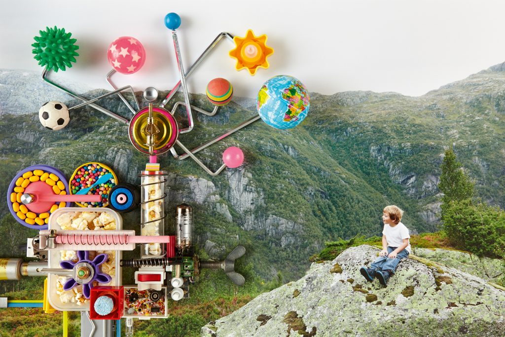
MP: It became one. But that’s the wonder of Jan’s images, these collages, is that you realize…
NH: …that they’re not on a uniform plane. Yes, true. Also they have a particular quality. What’s the right word? They’re a bit primitive or childlike in the way they’re made, while they’re also extremely sophisticated as images. The interesting thing as the printer of Jan’s work is to be able to capture that point where they are really primitive.
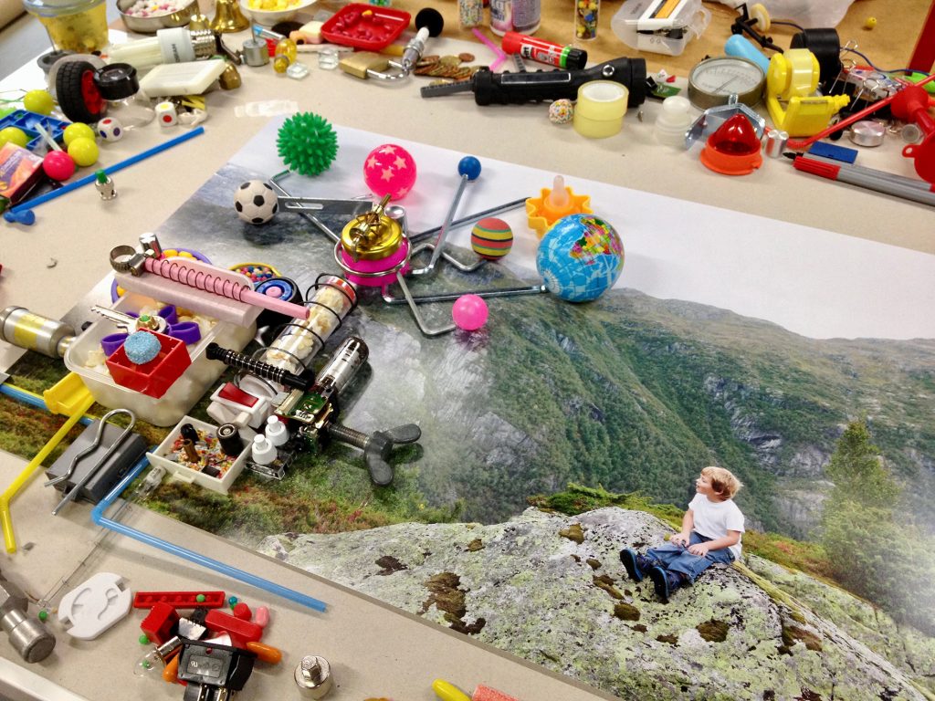
MP: It’s the moment when you realize that Jan built these machines by hand. He put Lego piece after key after bell after a little piece of string on top of these prints. They were built by hand.
NH: And without a lot of fuss. They are just not the slightest bit glossy. They’re very honest about what they are.
MP: I think back to the idea that Olav claims himself as the machine. Jan’s way of making pictures is a way that any child could also make pictures. They need to practice to make as wonderful pictures as Jan.
NH: They’re very sophisticated, yes.
MP: But the technique is there for everyone to try. And that’s wonderful that the message that’s told through the words in the book mirrors actually the technique of the images.
NH: Definitely. And even if one can’t accomplish the kind of dexterity that Jan does in these images, it nevertheless points out that there are other very accessible things one could do. One doesn’t need all the pyrotechnics and flashy stuff to produce good work.
MP: Simple means, right?
NH: Exactly. So even if this isn’t your means, it’s an example that one can do wonders with simple means. And you don’t have to gloss over the reality of what you’ve put together, you can be very honest about it. You don’t need to give it the super-model treatment.
MP: We can’t forget to mention the role of varnish [laughs] and the fact that you printed and threw away the cover…because it’s the same issue, right?
NH: Exactly the same issue. It’s about keeping the simple means visible and active in the images, not allowing it to be glossed over. In the prints, the objects that make up the machines tend to have very saturated, bright colors, so these areas of the prints have very high concentrations of ink, very high ink densities, and they appear to project forward in the image. Whereas in the landscape areas, the four colors that go into making the print are much more even and integrated, so they recede. The two different planes of the image – object/machine and the landscape – have markedly different structures in the print. The differentiation of the two planes is physical and optical. So as you look across the print, and particularly as the page bows a little bit…
MP: the light captures the density.
NH: Yes, we have to remember that a book is a three-dimensional object. It’s not flat. The slight bowing allows the complex structures of the print to come to life, and you see that the surface of the image is quite variable and diverse, in a way that supports the image itself. This isn’t easy to do, I should mention. When I was making the test prints, I discovered that it would make a substantial difference to print using a wet-on-dry process. That means that I print one ink at a time, I allow it to dry naturally by oxidation for 24-48 hours, and then I overprint the next color, let it dry, and so forth. As an ink dries it forms a brilliant, hard film on the paper that resists contamination by the next layer of ink. It’s like layering colored glass, each layer is hard and the color is absolutely pure. I sent Jan a number of tests, among them was one wet-on-dry print, and he spotted it right away and could explain exactly what made it different.
It was an experiment just to see if the process really was all that much better. It’s an obsolete process, but the old-timers in the printing industry still remember and are critical of the standard wet-on-wet printing that is done today. I really just wanted to see, and I never imagined the difference would be so clear and so compelling. And now I can’t turn back. It takes a lot more time. You can print all four colors wet-on-wet in one pass through a printing press, and the sheet will be done in thirty minutes. Each sheet in my new obsolete method takes five to ten days, depending on the drying times. So it’s a blessing and a curse. The curse part is why it’s obsolete. I want to clarify also that this technique, because of the labor, has limitations, and I could never make a book of more than 144 pages in this way, that’s the absolute maximum.
So when Jan’s prints were at the varnish stage, all of this work that I’m describing was behind me, and I was looking at the prints and thinking, I have this wonderful, active, diverse surface structure, and if I put the varnish on, it’s just going to even out everything on the surface and put it all on the same plane.
MP: Is the varnish protective?
NH: That’s the line. But I’ve never been convinced on this point. There’s very little that distinguishes a varnish, of the type that we use in the Steidl family, from a printing ink. It’s clear and it has a particular reflectivity. My prints are very stable already because of the wet-on-dry printing process. I already have four fully-dried layers of ink on the paper. I’m skeptical that a fifth clear layer is going to add much more protection. In standardized printing, the varnish can be used to support certain areas of the image that are not optimally or fully developed. For example, it will deepen shadows and increase contrast. It gives uniformity. But my printing is not standardized, it’s optimized. So aside from a decision to use varnish for a particular effect, I don’t need the varnish to help my printing.
There are so many details involved in a decision like this. Everything that has gone into making the book is suddenly on the line. In the background, though, was this issue of the cover that you mentioned. A bit earlier I had printed the two cover wraps, using the same wet-on-dry technique, and the plan was to have them laminated with a transparent, matte film to protect them from scratches during the binding process. This is a half-linen binding, and it’s a complex process in the bindery. I can’t do the lamination myself in my workshop, and you can image how much I hate the idea of someone else doing something to my prints. So I had sent off my prints to have them laminated, and what came back to me was horrifying. The lamination had killed everything that was unique about the prints. They were flat, dull, just awful. I knew that I couldn’t live with it, so I called Gerhard and he assured me that the wraps would be fine without lamination. So I threw them away and reprinted. The bindery I work with is exceptional. Only master bookbinders handle my books, and they took extra care with the bare printed wraps, and everything was fine.
But I was so horrified when I saw what had happened to my beautiful cover prints when they were laminated, and I knew that the same thing would happen with varnish. It would essentially flatten the images and bring the landscape forward so that everything would appear on the same plane. I knew I would be dissatisfied with that. And since we didn’t need the varnish as a crutch, the printing was already optimal, and we didn’t need any protection, I proposed to Jan that we leave the entire book unvarnished.
MP: And he said yes straight away, right?
NH: He said, fine, do it! [laughter]
MP: Another thing I love about the book is that there are aspects of the materials that you don’t necessarily notice on the first reading, or the second, or the tenth. There are actual parts of the physical book that reveal themselves over time as connected to the images. For example, the trouble we went to in finding the perfect head and tail bands. [laughter]
NH: Very few people have noticed those. [laughter]
MP: Or the color of the endpapers.
NH: The endpapers are immediately noticed and appreciated. But then the story of how many green papers we looked through, and particularly in the Hahnemühle Ingres line, how many papers are within close range of this green. I mean, it’s a very specific green.
MP: But firstly, to discount blue, right? Because my first idea was, well, let’s make it a blueberry blue, or a different kind of blue. To move from that to green was a big step.
NH: That’s right. But it’s more often the case then not, that design decisions based on language or concepts end up being really far off the mark visually. They hardly ever work. So I wasn’t surprised. But the green, on the other hand, works seamlessly with the images while also extending or reinforcing the literary position of the title. I mean, it mirrors the fact that we’ve announced a topic in the title of the book that isn’t actually resolved until the very end of the book. It’s the main question. So the green underscored the idea that we’re not providing any answers upfront. This is green, this is not blue.
MP: The green connects. It moves from the image on the cover to the image opposite the title page, which came very late into the design.
NH: True, I’m even shocked to see how well the endpaper works with the image opposite the title page. And I didn’t do anything at all to manipulate the colors in the image on press to make it perfect. But it’s seamless.
MP: And the head and tail bands as well have the green but then also the red of the Lego. They’re a combination of the landscape and Olav’s colorful inventions, the two layers of every image.
NH: I think it’s the element that only children are going to see. I’ve had to point it out to adults, including Gerhard!
MP: Really? I would think they’d be seen straight away.
NH: Because you know the whole story of how I sent Jan into Relma in Paris and guided him over the phone to the shelf where the red and green silk headbands are. And he made a really charming little video of the Little Steidl rescue mission to buy up the last roll of the red/green band at Relma.
MP: But for any book I look at the headband.
NH: But the thing is, these headbands are applied differently than at other binderies. Normally they’re machine applied in an in-line process. Our headbands are cut by hand, and they’re applied by hand because all the spines of these books are formed through a hand process, not by machine. So the headbands are very precise. And for someone who doesn’t know the story behind them, they might go unnoticed because they’re so precise. Whereas in the machine process there are slight deviations or imprecisions that occur and those catch your attention. There’s no error in our headbands, not even a quarter of a millimeter, they’re so good. So I think it’s going to be only children who notice them. But I’m sure they will, and I’m sure they’ll appreciate them.
MP: And we can’t forget the color of the cloth spine, which originally was more grey right?
NH: Hmmm…I don’t remember where we began, honestly. Oh! Yes, you’re right. We began with one of the Italian cloths, and then, because we didn’t need very much, we were way below the minimum order. So I switched to the van Heek cloth. And I’m always willing to switch to a Dutch product since my name is Holland. Seems appropriate! Then the fact that I could print it really convincingly in offset – I could get the intense black that we associate with foil stamping, but it’s better in offset because I can keep all the details of the typeface on the cloth. And then the van Heek line has such wonderful subtlety in the beiges, just a little more blue, or green, or grey.
MP: It picks up perfectly the moss on the rock on the cover.
NH: That match was an unanticipated gift of the printing process. At the point when we selected the cloth, I was matching it to a test print that I had made printing wet-on-wet. The wet-on-dry technique that I used for the final print brought out that subtle green tint of the moss. So that match materialized only later.
MP: I love that everything came from the same machine. You used the same press to print the spine, the cover images, and the book. It’s the idea of self-sufficiency, which is Olav all around.
NH: Ha! It’s one of the more subtle things that distinguishes Little Steidl books. I think it’s very important that the cover is printed in the same language or visual vocabulary as the content of the book. If we’re talking about a novel or a book that is only text, then I don’t have a problem with a shift to stamping or serigraphy on the cover. But it does bother me when a visual book is printed in offset lithography and then the cover is stamped or in serigraphy. That was one of the things I didn’t like about Lawrence Weiner’s first edition. That shift in the print medium from cover to interior disturbed me. The cover was serigraphy because, at that point, we didn’t know how to print the buckram book cloth in offset. I had to invent that printing method for the second improved edition, and even the cloth manufacturer was surprised that I could do it. I’ve done a lot of research and experimentation to find ways of printing various cover materials in offset, all with an eye toward building a consistent relationship between cover and content. The material shifts, but the printing medium remains consistent.
MP: It’s funny that whenever you pick up a book or even a magazine, you’re kind of used to the image on the cover looking different than the content. It’s so common that you just accept it. You even expect it.
NH: It’s one of the reasons why I had to destroy the laminated covers. I couldn’t accept that the cover would be a let-down compared to the images in the book. I go out of my way with all of my books to make sure there is this consistency from the cover all the way through the book. Even if it means I have to throw it away after paying for it and after all my work. So be it.
One of the things that strikes me about this book is that I think all three of us exerted ourselves to the extreme. [laughter] I mean, looking at it, I have no feeling that it could have been better in any regard. I feel that each one us delivered our absolute best for this book. Maybe ten years down the line, we’ll feel that we’ve improved, but at this point, I don’t think that any of us could produce a better product.
MP: I think that’s true. When you say this book took eight years, people ask why. And for me, I’ve learned the importance of creating something, and then letting it sit for a while and then revisiting it. You come back with distance and with a perspective that improves it. Maybe you’ll tweak just little things, but you’re able to see it more as a reader and less as yourself. It’s a good, healthy part of creating, of bookmaking, because, you know, what’s the rush?
NH: Exactly! I always think, a book is forever.
MP: You can only make it once. What’s the rush?
NH: Why would you rush to put something in the world that is going to last forever?
MP: And people don’t know it’s coming.
NH: So why not take the time? I have a friend who would say, if it’s worth doing, then it’s worth taking the time to do it right. Her words come back to me almost daily, in everything that I do, to remind me, just do it right. Whatever time it takes. That would be worth it.
MP: Because at the end of the day, there is only the book. At some point the three of us won’t be here, but The Blueberry Machine will be on the shelf.
NH: No context, just the book. No one knows if it came out six months late, or two months earlier. They only know if it’s right.
So I notice that we’ve been like Olav for the last two hours, deeply immersed in our process of making and the suspense of every turn and twist, and this is now the return to the real world: in the end, there is only the book on the shelf.
The discussion ends.
Thank you for joining us. We look forward to your return to our dinner table.