Construction and Design
Normally when we begin a book, Jerry Sohn and/or I have already spent years or decades in dialogue with the artist. Our bookmaking relationship began fresh with Jan, and the development phase was unusually complicated and protracted as a result.
In this case, I used the bookmaking process as a first path into the mind and visual vocabulary of the artist, which, for me, is not ideal. A book is a complex object, and it was a burden to place it center stage as I developed an understanding of Jan’s work. During the ten-year development cycle of Kosmos, I could not have learned everything I needed to know from the bookmaking process alone. The rich friendship and dialogue that Jan and I developed away from the book project was critical to finally bringing Kosmos into its correct form.
Phase 1
We began with ten planets spread over the table and Jan envisioned a single volume organized into ten sections, each devoted to a particular planet. His instincts and tastes also led him to envision a hard-cover volume in vertical orientation with a page format of approximately 190mm x 250mm, slightly larger than his previous books but still comfortable in the hands. This was our starting point: Jan’s first vision of what the work would be as an object.
Using the assumed page geometry – a trimmed double-page spread of 380mm width x 250mm height folded down the center – we established a series of possible image formats (format = width x height) for both horizontal and vertical 35mm images (aspect ratio 2:3). These were cut out of colored paper and pushed around to develop a sense for the organization of the two-page spread.
We printed all project images to these target dimensions and trimmed them by hand with a steel edge and knife on the large wooden work table. Hand trimming is a good way to become familiar with a specific format. The dimensions become part of the body’s knowledge, rather than an abstract fact. In this way, Jan and I could also begin to sense, but not yet really understand, how each image would function in a specific format.
The first reaction is instinctive: surprise, excitement, confusion, disappointment, often all at once. Jan came to the work process with already formed ideas about the right formats for his images. He had already imagined certain possibilities for the presentation of images in his desired book format. Most of our work in this early phase revolved around executing these preferences in a concrete form so that they could be encountered in a real way with the senses. Jan was quite satisfied with his choices.
Following the preparation of our working images, we selected a good book paper, cut it by hand – again with a steel edge and knife – and folded the cut sheets into four-page folios. Many 16-page blank signatures were assembled by combining four trimmed folios. Through this tedious process we developed a deeper corporeal understanding of the flexibility or stiffness of a particular paper in relation to the desired page format as well as its grain structure and folding characteristics.
We then worked on one planet at a time. First with the images spread over the table, we sequenced and discussed pairings of images. Whenever we had a good working sequence, we taped the images into position in the blank signatures. The sequence was then evaluated as it is actually experienced in a book. Almost every sequence worked out on a tabletop will reveal weaknesses when examined as a signature. Images are hinged loosely for this reason. Jan worked instinctively, taking the signatures in hand and relocating the images until he was satisfied, at least for the moment. We worked in this general way through each of the planets.
Next we took a broad view of all the planets housed in the loose signatures to get a sense for overall length, possible planet order, and the rhythm of the work as a whole. The modular process allowed us to evaluate several possibilities for the structure of the book and to understand how the image selection and sequence could be sharpened. At this point, the work became a great puzzle in which Jan could immediately experience the effect of any single change on every other element. It is an illuminating but frustrating experience. It would be impossible to grasp and explore so many simultaneously emerging paths. But this is of no consequence. At this stage we are only developing insight. The options that we need to evaluate seriously come much later in the process.
At this stage, I observe the artist’s reactions and struggles closely. They reveal to me the artist’s deeper, intuitive intentions for the work, which often contradict what an artist consciously prefers or chooses or even insists upon in the development of a book. My job is to reveal options to the artist that satisfy the deeper intentions of the work more precisely. But that was still a long way off for Jan’s Kosmos.
I worked with Jan over the span of a week, 15 hours per day without any distractions. When Jan felt resolved with a particular sequence of loose signatures, I stitched them together into a book block for re-evaluation. To bind the signatures along the fold changes the way we perceive them. It adds depth to the developing object and draws the page surface into a three-dimensional form. The subtle structural variation at the spine, as one progresses toward and away from the center of each signature, is activated. I encouraged Jan to experience the book block in various parts of the house: seated at the table, standing at the workbench, on the lap in a comfortable chair in the library. Jan’s book appeared quite differently in each place. Weaknesses were noted and further changes made.
I was proud of Jan for enduring so much, and when the week came to an end, he had a working maquette in hand with which he was really quite satisfied. There was still much more to consider.
At these moments I return to two things: the visual material and the goals of the work. I study these closely for clues. Jan’s work is playful, vibrant, rhythmic and humorous. Upon first glance, the images provoke an instinctive, sensory engagement in the viewer, and upon the second glance, they reveal the evidence of how they were made. It is a two-part rhythm of interaction: a rapid aesthetic response followed by a fast application of the brakes to allow for a different kind of observation.
The single volume we had developed to date gave the impression of a nicely designed catalogue of a wide range of photographic projects, each with its own section. It looked serious. It lacked life. The images were not performing as intended. As a catalogue, it would have sufficed – that is, as a documentation of work that has its “real life” somewhere outside the pages of the book. But catalogues are not really our thing. We are concerned primarily with works that need to be books. Jan’s planets did not exist as exhibition prints on a wall. They were intended to exist only as a book work. Certainly, they deserved much more from us.
I questioned the vertical orientation of the book. Jan’s heart was unwaveringly invested in it. Eight of the original ten planets had a horizontal orientation. The abundant negative space resulting from a horizontal image on a vertical page was working against us. The images were tamed by the formality of their framing. The negative space kept the upper hand and not a single image sprang from the page with life.
Nor were the planets functioning as ensembles of images, because the negative space segregated the images into isolated units, imposing its own pedantic rhythm at the expense of the distinctive rhythms in the images themselves.
Another failure was the scale of the horizontal images: too small to engage a viewer in the visual riddles at the heart of the work. Any enlargement of the image would result in a proportional enlargement of the page and thus the negative space, bringing all problems along with it.
Phase 2
We turned to the transitions between planets in an attempt to bring greater emphasis and clarity to the groupings of images. Jan shot a series of skyscapes at various times of day from dawn to dusk and we used these for the cover cloth, the end papers, and the breaks between planets. This was ineffective. Rather than draw the ensembles of images together, it added yet another element, this time with a foreign visual vocabulary, to a collection of planets that was already too large.
This sort of conceptual solution can be enticing. At first, when it is only a thought, the idea seems logical, sometimes even elegant. But when one takes the time to build the idea with real materials that can be encountered and evaluated with the senses, it often proves to be very thin and unsatisfying. No matter how good an idea seems, I find it is never a waste of time and effort to build it and then decide. No amount of thinking will produce a material work that works. Such a work comes into the world through making and learning. I have not found a reasonable shortcut.
During this phase, Jan also suggested the possibility of showing process images in the back of the book, probably instinctively to make up for the fact that the images themselves were not effectively revealing how they had been made. These also felt like add-ons, which were ineffective in helping the primary visual content to do what it needed to do.
Phase 3
We looked at the effect of removing the negative space from around the horizontal images. In other words, a full-bleed image or an image with a narrow border on the recto with a blank verso. This shifted the book to a horizontal orientation. It increased the tempo of the work, which relieved the ponderousness of the vertical format. But now the tempo was too fast and the images were reduced to a series of snapshots. Jan continued to resist any shift to a horizontal format, and we abandoned this path.
Phase 4
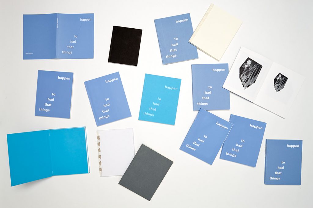
We had produced a good-sized crate full of maquettes of Kosmos, all unsatisfactory, and the way forward was not clear. So we waited. Years passed.
I moved to Göttingen, Germany, where Jerry and I set up Little Steidl as an independent publishing house next door to our former partner, Steidl Verlag. I simultaneously began what became a six-year-long (and still going) intensive apprenticeship in printing at Steidl.
I prepared three or four new books with Jan while we waited for a resolution with Kosmos. Here are the maquettes produced for another project while we waited:
Phase 5
Up to this point we had allowed the book to perform an averaging operation on the planets. All were presented acceptably, but not a single one optimally. In a single volume, or even a series of volumes of uniform format, each planet would bare the burden of a compromise. This was unacceptable.
It was time to start again, with no expectations about the final object. Maybe Kosmos would be a book, maybe another type of print work, but there would be no compromises.
I sensed that each planet needed something different. Not a single, uniform solution. At the same time, the planets had the following qualities in common, and these became the organising principles behind the form we developed:
– The planets share the 2:3 aspect ratio of a 35mm photograph.
– The planets share a common work method: Each was constructed in front of the camera without any digital manipulation. Each image contains the story, or the visual evidence, of how it was made.
– Each image operates through a particular cycle of discovery: The pleasure of an image comes first, and the understanding of an image comes second. They work together in a particular order.
Scale became the primary tool to animate the distinctive balance and rhythm of each planet. The optical or photographic principle behind each is different, and each can be expressed, we discovered, only within a precisely and uniquely scaled space. There is a wonderful truth in this, and one must only look at our own solar system to see it: each planet has its own character, its own logic, its own size, yet they are bound together in a system.
Every planet discussed below went through an initial format test in which I printed and trimmed each image multiple times, making at first larger leaps and then finally shifts in millimeters. After two weeks, a mountain of paper trimmings reached the ceiling of my studio. With each planet, the correct scale was surprisingly precise – a shift of only 2 to 5 millimeters in the format could disrupt the balance we were seeking.
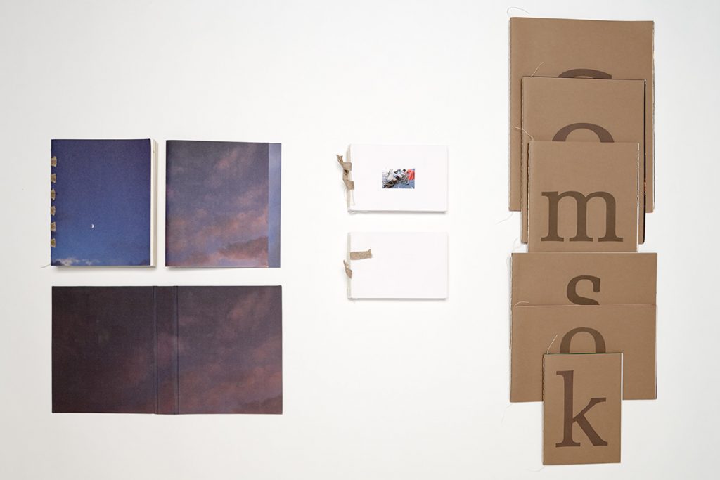
I carried out this process for all of the original ten planets and only later considered whether each of those planets was a necessary piece of the kosmos. At the end of the process, we agreed that six of the ten planets would make the final cut.
The following image shows the transformation of the object into six objects with unique formats. However, the cover design came much later in the process and will be discussed below.
Freed from any preconceptions about what the form of this Kosmos would be, it was clear and easy to specify what each planet needed:
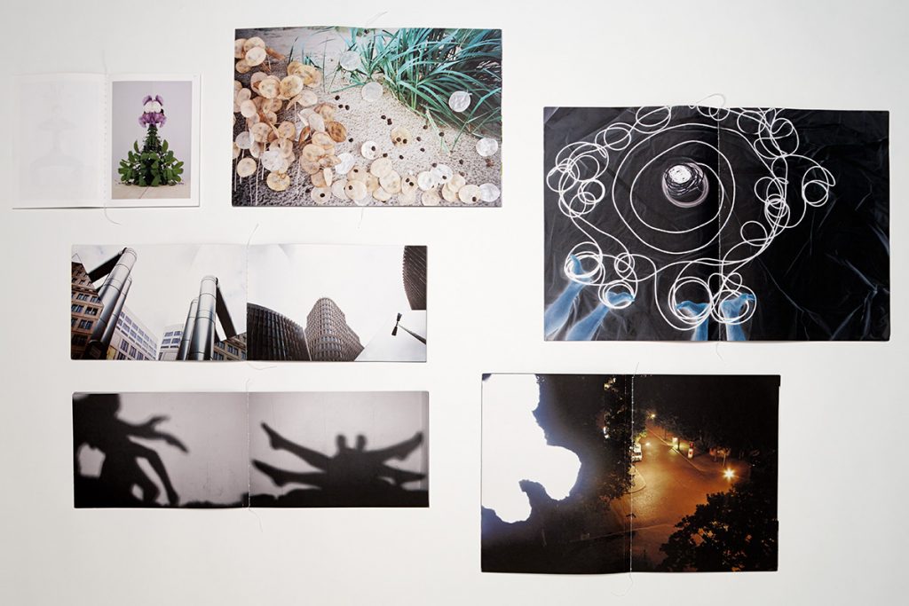
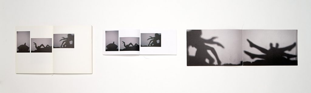
Planeta Symmatrius
The preparatory sketches of the monsters were drawn by Jan and a young friend in pen on paper. They spring directly from and are scaled to the mind and hand of a child. The creatures later created by Jan, which we used for Planeta Symmatrius, should be small enough so that the entire monster is seen first as an entity, but large enough so that the viewer is provoked to reverse engineer the monster into a dozen body or plant parts and a mirror. A shift of even 2mm in the image format will bring the eye immediately to the disparate parts, so that the creature is not at first perceived as a creature. Moreover, the qualities of the mirror as an optical device should be perceived through its effect on sharpness and its tendency to create double images in the monsters’ extremities. This is an important aspect of understanding that the image is constructed in front of a camera, not on a computer.
This is the only planet that is encountered through a series of portraits of its creatures, as opposed to its landscapes. We found that a small border around each vertical image was consistent with the images as portraits, and it gave the possibility of pairing images on verso and recto.
The following image shows Planeta Symmatrius at three stages of development (Phase 1, Phase 3, and the final format).
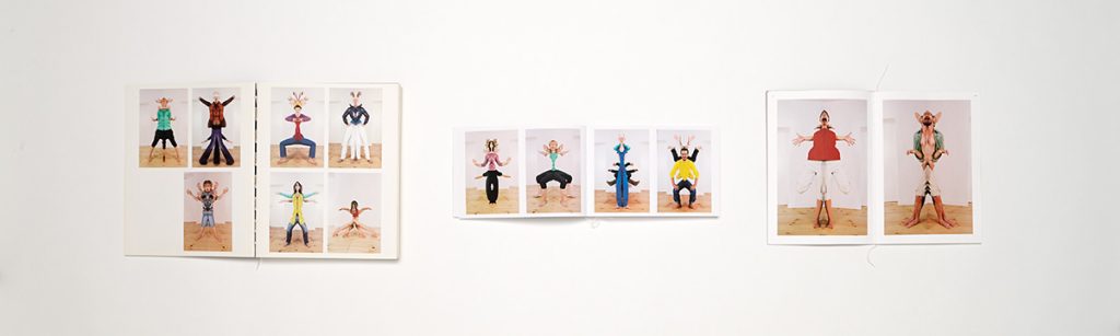
The number of creatures to be encountered was a sensitive issue. Jan shot at least twice as many creatures as made the final edit for the planet. In the earlier phases, he insisted on including all of them and had organized them into modular grids over the two-page spreads, which meant the images were much too small to be experienced fully. At this scale and with so many to take in at once, the creatures were more conceptual than material. I preferred a narrower selection that would keep attention focused on the subtleties and ambiguities of the images.
Up to this point, Jan had made all the edits. I learned his priorities in this way. I also saw that he was personally invested in every image and in every planet in a way that did not allow him to make edits where they would best serve the work. Personal connections that were tangential to the images were often taking priority in the editing decisions. Yet a reader does not share the personal connections of the artist or even know them. A reader knows only what can be seen, and, in the future, will observe in a context that we cannot today imagine or know.
An artist book differs from a catalogue in many ways. An artist book does not represent a collection of works, but is itself a single work, and if any element does not play a role in advancing its visual development, it should probably be eliminated. Kosmos needed not only an image edit, but a planet edit. Jan was sufficiently resistant to letting any image or planet go, so we had to approach the issue in another way.
Working on my own, I printed out the entire series of monsters at the ideal dimensions and lay all the creatures on my bedroom floor, where I would be sure to greet them every morning and every evening. I knew how Jan saw each one, but I wanted to know them as characters on their own terms. Occasionally I would rearrange the monsters and gather them into pairs and small groups. They began to communicate with each other in ways Jan had not yet imagined. Eventually I had a clear understanding of the edit that was needed. I produced a full maquette and re-introduced Jan to his monsters. They exceeded our expectations. Everything seemed just right. But to be sure, we examined the images that had been eliminated just to verify that nothing essential had been left behind. To our satisfaction, we could see that each eliminated monster was not needed for this particular work, and Jan let them go as easily as if he had not made them.
Planeta Microidi
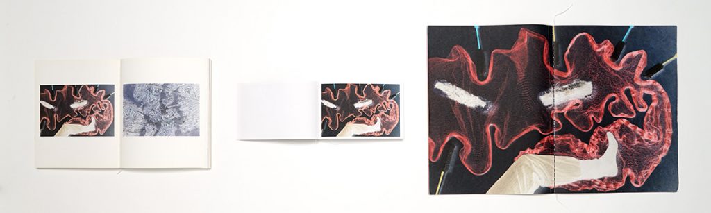
Everyone who has seen Kosmos in development has a favorite planet. Planeta Microidi is my personal favorite. Although like a parent, I love them all. We also referred to these images as the microhumanoids. This is a world seen under a microscope – something invisible and unfamiliar that, thanks to the enlargement factor, becomes a space that can be entered and experienced.
The nagging disappointment I felt throughout the first phases of this project came from the fact that I loved these particular images so much that I could not accept they would be anything less than their best. The movement of the eye through the images is such a pleasure. They should be large enough to allow the eyes to dance, to move in and around the curves and folds. Then there are certain colors that need to cover a large enough area to be really satisfying. One simply needs enough of a particular turquoise or a particular magenta. Otherwise it is like a delicious dessert that is too small.
I have also discovered that the optical device that operates in this planet is the most difficult for readers to identify: the color negative. One needs the enlargement factor in order to see into the anatomical details of the creatures – folds of skin, hair on arms. Once this bodily connection is made, one can see that there are highlights where shadows would be, that there is cyan and malachite green in the place of skin tone. And then one suspects there might be a reason why the banana skins are Prussian blue.
This planet was the starting point for understanding the function of scale among the planets. For what was so clearly needed for Planeta Microidi would have been a disaster for any of the other planets. It was the hint I needed to start down the path of finding each planet’s unique secret.
Below Planeta Microidi is shown in three different stages of development culminating in the final format.
Planeta Microidi also provided the model for how to bring the images into a book form. The question was still open if the book form could actually serve these planets in an effective way. At the desired scale, these images are too large to be placed on a single page. I considered how we might be able to achieve the scale while holding to the technical restrictions of the book.
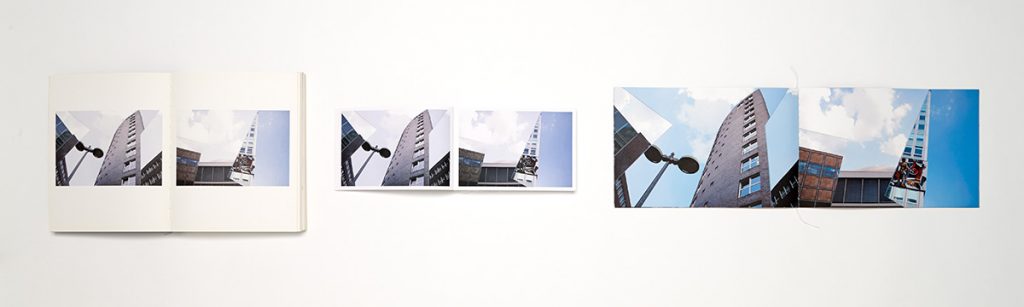
Over several years, I had become aware that Jan favors a composition in which the center is left open or unoccupied. I quickly surveyed the planets for this feature and realized that all of the images, with the exception of the monsters of Planeta Symmatrius, could function as two-page images with a fold down the center. The 2:3 aspect ratio of the 35mm photographic format became the basic format of the open two-page spread. For the two panoramic planets – Planeta Visumbra and Planeta Isolametro – the 2:3 aspect ratio serves as the structure for an individual page. This also solved the long-standing dispute over a vertical vs. horizontal format for the book. I could eliminate all negative space and keep the vertical format. In the case of the panoramic planets, Jan was happy to move to the extended horizontal format.
A double-page image must lie absolutely flat. This requirement supported the idea that each planet would be a separate volume, each constructed as a short, stitched, softcover book with a unique format, each ranging from 12 to 48 pages. The content, form, and construction were now coming into a dialogue with each other.
Planeta Visumbra and Planeta Isolametro
These planets share a format. Each was conceived by Jan as a panorama. The images were to be connected in a continuous horizontal progression. The uniform format was not contrived. Each planet simply functioned correctly at this scale. The page is 27.5 cm wide, producing a 55cm wide double-page spread. For technical reasons, I cap a page width at 29.7 cm. For both Planeta Visumbra and Planeta Isolametro, the maximum width proved too large, and I scaled each back in steps of 1-2mm until the images worked as Jan had intended.
Our capacity to take in a horizontal span with a single position of the eyes is limited. Both of these planets played right on the edge of this limitation. Ideally the eye should move across the landscape/cityscape, which means it should extend a bit beyond the limits of our vision. At the same time we did not want to disrupt the dialogue between elements in these landscapes. The composition should remain strong and fully perceptible, and the distances between elements should not be too great. The balancing point was the same for each planet, which had a lot to do with our capacity to see.
Planeta Visumbra was shot against a classic German household wall: the surface is wallpapered and then painted white. One can see the panels and texture of the wall paper in the images, along with electrical outlets and corners. The factual, visible architectural support hosts an invented shadow landscape with creatures. This seemingly artless and naive meeting of something real with something invented is at the heart of Jan’s work, but also Jan as a person. It’s as if he is saying, I’m playing here, and I have no reason to disguise it. I am having too much fun to be artful. The reader needs to see the details of the wall to get into the spirit of this planet.
Planeta Visumbra is shown below at three different phases of development, culminating in the final format.
With the extreme horizontal format of Planeta Visumbra anything wider than 55 cm disrupts the dialogue that Jan creates between the left and right halves of the spread. The distances between elements of the landscape become too large. At the same time, it is critical to have a sense of horizontal expansion and unfolding. Anything less than 55 cm across the spread can be contained too easily by the eyes, and the horizontal movement of the planet comes to a standstill.
With Planeta Isolametro, the mirror returns as the central optical device, but this time it is used toward an asymmetrical end. As with Planeta Symmatrius, the tonal shifts and subtle distortion introduced by the mirrors is critical to understanding how this cityscape happened. The angular patchwork rhythm of these cityscapes is quite rapid in comparison with the simpler shadow landscapes of Planeta Visumbra. The identical formats enable very different compositional tempi. Planeta Isolametro would be significantly slowed down with a format enlargement and the rhythm lost. One needs to see many places in the same place at once. The eyes should not at first take in each fragment individually.
Again in three phases of development, Planeta Isolametro is shown below.
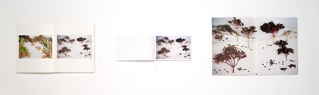
Planeta Florala
In Planeta Florala, Jan plays with the photograph as an object. A photographic print forms the background, on which he makes amendments with plants and objects. The entire composition is then re-photographed. In contrast to the panoramas, which lie slightly beyond our visual limitations, the landscapes of Planeta Florala must sit just within these limits. We should be able to take in the two-page spread as a discrete object, contained by the eyes and fitting comfortably in the hands.
This planet is challenging to figure out. It has a surreal quality that comes from the fact that background and foreground objects represent different scales but form one integrated, constructed landscape. Instinctively the format that spoke to me for this planet turned out to be very close to the scale of the original background photograph and the objects placed on top. This veracity of scale is important, that is, all objects (photograph and plants) are shown in the book true to their original scale (or close to it) and the book format does not introduce a third significant scale shift. It’s true to life, as constructed by Jan.
One of the most helpful clues about how these landscapes operate is the fact that the plants cast shadows on the sky. The detail is difficult to perceive if the images are reduced in scale.
Planeta Florala is shown in three stages of development below, including the final format.
Planeta Phantafulgeo
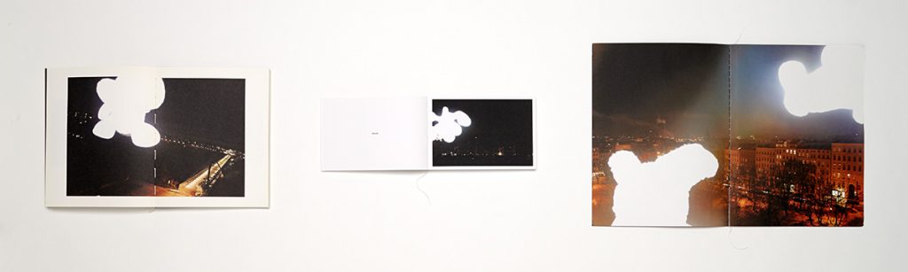
The flash ghosts inhabit the Berlin cityscape at night. But I find their graphic presence on the page more interesting: their shape, their placement, their absolute whiteness, as if part of the image has been ripped out. Like the rapid flash and burn-out that creates the ghosts, the resulting images are quick, even instantaneous images. The ghosts are bouncing around the city, flashing here, flashing there. This is the fastest planet in the Kosmos, and detail is simply not so important.
I tried this planet first at the same scale as Planeta Microidi. The Berlin cityscape took center stage and the ghosts lost their punch. But when the scale is reduced a bit, not much, one does not instinctively look into the detail of the cityscape. I wanted to keep the reader turning the pages quickly, as if this is a song with seven beats, and then it’s done.
Planeta Phantafulgeo is shown below in its three stages of development.
The Texts
The journal entries that appear on the title pages were written from the point of view of the character Jan had instinctively slipped into when he created his kosmos. We wrote them together, collaboratively, and they were intended to introduce a bit of the back story of the project, without providing any explanations. Each text is a riddle that can only be understood after one has done the work of figuring out the planet. They were written long after the entire project was in its final form. Likewise were the planet names devised only at the very end of the development process. These were final details.
Covers and Materials
The typeface used for this project was designed by Hermann Zapf: Melior. The subtlety of the thick/thin variations in Zapf’s typefaces, and in Melior specifically, have something in common with the contours of the body parts, particularly arms and legs, that appear repeatedly throughout the planets. To my eye, the letterforms were an extension of the basic materials from which Jan’s Kosmos was made. Jan fell in love with this typeface on first sight. There was a logic to his reaction as well: his favorite typeface is Optima, also a creation of Hermann Zapf.
I take great satisfaction from the reactions of typographers when they encounter this typeface on the covers. It’s immediately familiar yet not quite identifiable, always on the tip of the tongue, always just beyond reach. It is simultaneously grounded and evasive, a rather good combination, I find.
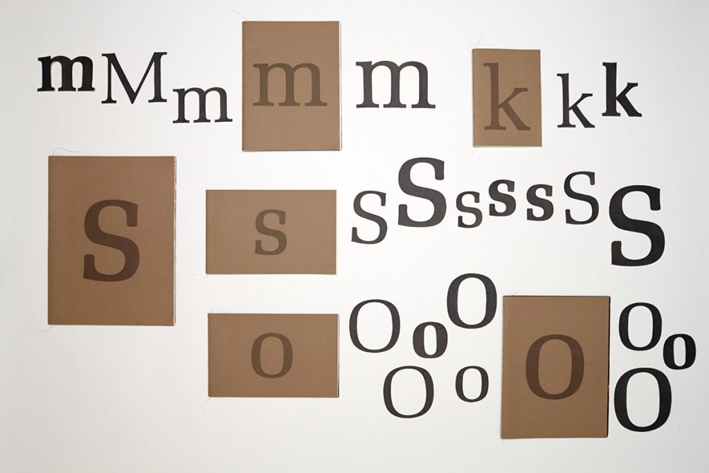
I cannot today remember all the variations of cover designs that we considered, only the rudimentary process of printing and cutting out the letterforms at various sizes and weights, capital and lowercase, and working to match precisely the scales of the letterforms to the scales of the planets. How to then make the variations of type size work within the series was an open question.
I happily stumbled upon the fact that we had six planets in our final selection, and our title conveniently had six letters. At this stage, the planets did not yet have names. We had considered numbering them, but this would place them in a particular order or hierarchy that was unwanted. Jan also did not want the reader to assume that the planets progressed from smallest to largest. By placing one letter of the title on each volume, we were able to create a unique graphic identifier on each cover while maintaining sufficient ambiguity about the order of the planets: there are two S’s and two O’s. One letter per cover also meant that the letterforms themselves could appear large enough to show off their wonderful corporeal details.
I drew and filled in the letterforms with pencil on the maquette covers, and the graphite appealed to us. It’s a bit metallic, like a spaceship. This quality was carried forward into the printing and we mixed a special grey that matched the graphite.
The “basic brown” paper of the covers is actually an exceptionally beautiful paper produced by one of Germany’s oldest paper mills: Gmund. We wanted the covers to be neutral and stand in contrast to the intense colors of the visual material. The tone of the paper was important. Many basic brown papers are too blue and a bit too dark. We needed a yellow-toned brown, something haptic and luminous that would not appear dull or muddy in comparison with the colorful book interiors. Neutral yes, but not dull. We had a very good option in hand when Gmund announced a new paper series: No Color No Bleach. This was the paper of our dreams, and we happily made a last minute switch.
The paper used for the book blocks was decided very early in the design process: Profibulk 1,3. It is a high-opacity, matt, clay-coated paper with a volume of 1,3. The inks sit on the surface with an almost waxy, pop quality. The books have a decisive character as print objects. We wanted the paper to be moderately thin and to feel loaded with ink. This requires a particular opacity and volume. We also wanted the paper to have sufficient flexibility so that changes of format from book to book register in the hands of the reader. I showed Jan some printed examples and he immediately said, yes, that’s the paper. I believe this conversation took place long before we had found our way into the final design phase of the project.